Free Textures over the Weekend

Hi there!

This past weekend, I sent out a free download of 15 Paper Textures for all subscribers to TheVectorLab's email newsletter.

If you missed the email, you can still get them as part of Graphic Design Launch Kit, by signing up for my newsletter.

A collection of 15 stained, crinkled, and distressed paper images. These are pixel-based (not vector) high resolution jpeg files: 2400 x 3500 pixels. Great for backgrounds. Use these by placing them in Photoshop or Illustrator as a multiply, screen, overlay, or darken layer on top of your design to create a natural distressed look.

If you want to convert these textures to Photoshop Brushes, it's easy:

Pivotal graphic in my design career

In 2005, I cold-pitched this design to Local Motion in Hawaii. They bought it, along with a few other graphics.

IMG_3867.JPG

All of a sudden, all my trips to Hawaii were business write-offs. This led to me doing more graphics for other Hawaiian surf companies like T&C and HIC.

Billabong hired me because they needed someone to help out with Hawaii and destination tees and in-line designs. Then this eventually led to doing work for O'Neill, as well as a lot of other designs I've made in the surf industry.

This graphic was made from a crappy snapshot of an old ford bronco that I spotted in Ala Moana Beach Park. I plan to do a design tutorial soon showing how to make t-shirt graphics using this method.

The thing I like about this design is it still looks fresh. How about a reissue? I still have the Illustrator file.

What do Whales in Tonga have to do with Graphic Design?

2016 so far has been the year of the WORKSHOP. I teach a few of them, myself (you can see the workshops here). But I also participate in other experts' workshops.

For instance, early this year, I went up to Portland Oregon to learn Hand Lettering and also Screen Printing from the guys at House Industries. House is a font foundry and design studio that has been putting out great stuff for more than two decades.

The most recent workshop I attended was a whale photography workshop hosted by Australian Nature Photographer, Craig Parry. I've been wanting to improve my photography skills for some time now. And the Kingdom of Tonga, with its yearly migration of humpback whales was the perfect place to hone those skills.

The whales can move quickly, so the added pressure of a moving target really helped cement the camera settings in my mind. It's all about anticipating and quickly adjusting the camera settings: F-Stop, Shutter Speed and ISO.

We shot everything in Manual mode. I learned from day one that if you try and shoot underwater in Automatic mode, your photograph will come out sub-par almost every time.

I use quite a bit of photography in my designs, so these new found skills will come in handy down the road. I'm hoping to sell some art prints, or perhaps turn some of these into t-shirt designs.

Tonga has the clearest, most deep blue water I've ever seen. A big plus for underwater photography.

The "over/under" or "split shot" is another water photography technique we worked on. This is one of the many small islands in the Vava'u group.

A curious baby humpback approaches (and dwarfs) one of the photographers who participated in the workshop.

A palm tree-filled beach in Vava'u, Tonga. This might make a good t-shirt design!

45 feet in length. 80,000 pounds. Humpback whales are some of the most gentle creatures you can witness in the wild.

Follow along to see more photos and graphic designs in my Instagram feed:

How to present your t-shirt designs just like the big apparel brands

Have you ever stopped to notice how big apparel brands like Nike, Topman, and Quiksilver display t-shirts and apparel on their websites and in their catalogs?

Often they are photographed on a mannequin with great studio lighting.

The studio background, along with the mannequin neck and arms have been erased from the image. The inside portion of the collar and neck label have been Photoshopped into the image to complete the look of the shirt.

This kind of image emphasizes the graphic design, fabric color, and shape of the garment itself.

If displaying apparel in this manner is being done by these big companies, then there must be a reason. Right?

Perhaps they have discovered that this is the most effective way to appeal to their customers.

I have always been of the opinion that the better the PRESENTATION of your designs, the higher likelihood you will increase your sales.

This is why my apparel templates have been photographed in a similar way. On mannequins in a studio with proper lighting.

In addition, the templates have been set up with the ability to easily:

  • Add in your graphic
  • Change the fabric to any color
  • Warp your graphics to match the shape of the shirt wrinkles for extra realism (Photoshop only)
  • Mock up front views and back views
  • Add in your own custom neck label design
  • Use with Photoshop and Illustrator
  • Crop the edges of oversize graphics to the shape of the shirt
  • Choose regular cotton or heather texture (like poly-cotton or tri-blend fabric)
  • Display over any background image or color (the backgrounds are transparent)
  • Add in a pocket (select templates)


If you are a graphic designer or have a business that sells t-shirts, I believe that my mockup templates are the fastest, easiest, and best looking way to make your designs look real. Just as if your designs were photographed in a studio with professional cameras and lighting.

Now you can get ALL of my men's mannequin-style mockup templates in one brand new bundle, for more than 50% off!

This includes all 113 mockup templates for:

  • men's short sleeve tees
  • v-necks
  • tank tops
  • zip & pullover hoodies
  • crew neck sweatshirts
  • long sleeve thermals
  • polos
  • raglan baseball shirts
  • long sleeve tees

Each style of shirt in this bundle has multiple images, photographed with the same camera angle and lighting so they look consistent on a page. But each one has a slightly different shape so it's not apparent that they are mockups.

What I learned as a design student

When I was a student at Art Center College of Design in Pasadena, one of the things I appreciated was that the instructors were required to also be working professionally in their chosen fields of design.

I felt this added credibility to what the instructors taught. As a student, you could be assured that the instructors' teachings were relevant to current design trends and met realistic design constraints & capabilities.

I try and do the same with my own business & teachings by designing for companies in the real world.

As some of you know, in addition to running TheVectorLab and teaching Graphic Design Workshops, I also design t-shirts and prints for the surf apparel industry.

I recently updated the blog with some graphic designs from my personal portfolio. I hope you enjoy!

Ray Dombroski

If you want to see more designs like this, have a look here:
Behance
Dribbble

Prints for O'Neill Boardshorts

T-shirts aren't the only thing I design! Here are some boardshort prints for Summer and Fall 2016 seasons for O'Neill. Trims, construction, and design details were finalized by the on-staff Boardshort Designer at O'Neill.

O'Neill is known as the Original American Surfing Brand. Founded as a surf shop and wetsuit company in Santa Cruz, California in 1952 by Jack O'Neill.

Plastisol: Cracked Ink Textures for T-Shirt Designs

How do graphic designers get a vintage cracked ink look for their t-shirt designs?

It starts with Plastisol Ink.

Plastisol Ink is a type of Screen Printing Ink that was first used to screen T-Shirts in the 1970's. When you look at Vintage Clothing, it's the ink that cracks and flakes over time as the t-shirt gets washed, stretched out, and worn to too many Def Leppard concerts.

I've wandered through thrift shops, vintage clothing stores, and flea markets to gather only the best t-shirt specimens. These t-shirts with aged, worn, and washed cracked ink were then scanned into the computer. The scanned images have been turned into a collection of textures (bitmaps, JPEGs and Photoshop Brushes) that you can use to make your own t-shirt designs look vintage.

This collection of textures has been named "Plastisol"

This collection has 10 different 'base' textures, each with a Light, Medium, and Dark version. The "Dark" textures are the most beat-up, vintage, and abused. The "Light" textures have less weathering or "distress."

Each of these 30 Textures comes in the following formats:

• Medium-Resolution Photoshop Brushes (1500 x 1500 pixels - for ease of use and web-oriented graphics)

• High-Resolution Photoshop Brushes (2500 x 2500 pixels - maximum brush size for older versions of Photoshop)

• High-Resolution Photoshop Brushes (3000 x 3000 pixels - for real t-shirt graphic production or high-res graphics)

• Photoshop PSD (3000 x 3000 pixels - flattened greyscale files)

• Bitmap Tiff (3000 x 3000 pixels - these files are the ones you use in Illustrator) 

(Please note, there are no vector files in this collection. Use the Bitmap Tiffs in Illustrator for much more detailed texture that won't bog your computer down).

My favorite versions are the BITMAP TIFF files and the PHOTOSHOP BRUSHES! 

BITMAP TIFF: The white areas in these textures will be transparent when you place them into your Illustrator files (yes Illustrator!) on top of your vector graphics. Color these the same as your background, so it looks like the background is coming through your graphic. This method of adding texture is an old-school trick used by all the veteran t-shirt designers out there.

PHOTOSHOP BRUSH: What can I say... these are super easy to use. Just double-click on the .abr file and these brushes will load into your Photoshop Brushes Palette. Select a brush, and click to paint in your vintage texture!

Graphic Design Workshops

With Graphic Design, the key to increasing your productivity is to learn new skills and acquire more knowledge.

The following 3 Workshops + Bundles are aimed at helping you improve your Lettering Designs and T-Shirt Graphics.

1) Typographic Logos Workshop

Type-based logos, also known as logotypes and wordmarks, are a powerful way to define the style of your brand. Designing custom lettering (instead of using a pre-built font) is your opportunity to make something truly unique.


Design a t-shirt like a professional: graphics, specialty printing methods, fabrics, inks, dyes, and washes. In this workshop, we'll go over all the ingredients that go into a t-shirt design.


Improving your Graphic Design skills is one of the most rewarding investments that you can make in your design career. In this workshop we cover the entire process of creating a t-shirt design, from finding ideas all the way to sending your designs out to be printed.

A Free Preview of T-Shirt Design Workshop 2

Lecture 1: Tools and Materials for T-Shirt Design

This free section of T-Shirt Design Workshop 2 is a discussion of the essential tools for t-shirt graphic design. The traditional "analog" tools are different kinds of pens, pencils, and paper. The "digital" tools are computers, software, cameras, and drawing tablets. 


T-Shirt Design Workshop 2 is a 2.5 hour course is all about CREATING T-SHIRT GRAPHICS. It is packed with loads of actionable t-shirt graphic design techniques that can’t be found anywhere else.

Video Trailer

    • Design like a pro, working seamlessly between Photoshop, Illustrator, and pencil & paper. Ensure that your designs come out as good or better than you had initially imagined.

    • Learn two different methods to create your own Color Separations (using Photoshop and Illustrator) without the need for any extra other expensive color separation software.

    • Learn the Digital and Analog tools essential to being a t-shirt graphic designer.

    • How to access and use hundreds of top quality fonts with Adobe Typekit, included at no extra charge with most Adobe Creative Cloud subscriptions.

    • Create your own Photoshop Brushes to quickly add hand-made texture and color to your graphics.

    • Make multiple colorways of your graphic so it looks great on light, dark, and colored shirts.

    • Avoid common mistakes by properly setting up your designs to be printed with the exact colors, sizing, and placement that you want.

Read the Reviews

A screen capture of reviews from Udemy.com (where the course is hosted) as of July 13, 2016.

The Course and Bundle Options


7 Steps to get your Dream Graphic Design Client

Today's post is related to questions I often receive about how to get graphic design gigs, especially with your favorite brands. 

The question usually sounds something like this: "How did you get, or how does one get, a client like X? I really want to get into doing design for the surf, skate, outdoor, motorcycle, athletic, yoga, etc. industry, but find it a bit difficult, considering I don't live nearby. Any suggestions, dialogue, etc. would be appreciated."

How to get your Dream Graphic Design Gig

My answer is skewed towards t-shirt graphic design because that has been my focus, but you can take the spirit of it and apply these steps to your own desired flavor of graphic design work.

Going back to my first clients straight out of design school, the following are the steps I took to get my first surf industry clients like Ocean Pacific, Local Motion, T&C Surf Designs, and Body Glove. These are also the steps I would take now to find new desirable clients:

1) Decide on a company to target.

Small to medium sized companies are the best bet. But I imagine this strategy could also work with large companies like Nike.

2) Find the appropriate contact person.

Find the name of the Art Director or Creative Director for your desired line of work. Example: t-shirt graphics, marketing, etc. LinkedIn is probably the best way to find out who is who nowadays.

3) Make initial contact

Call the company, ask for the Art Director, and ask that person if they take outside submissions for artwork. This step is optional, but it's a good idea to give it a shot. I feel like a telephone call is more effective because EVERYONE ELSE would attempt this by email. The point here is to stand out just a bit by displaying some effort.

4) Make your own project

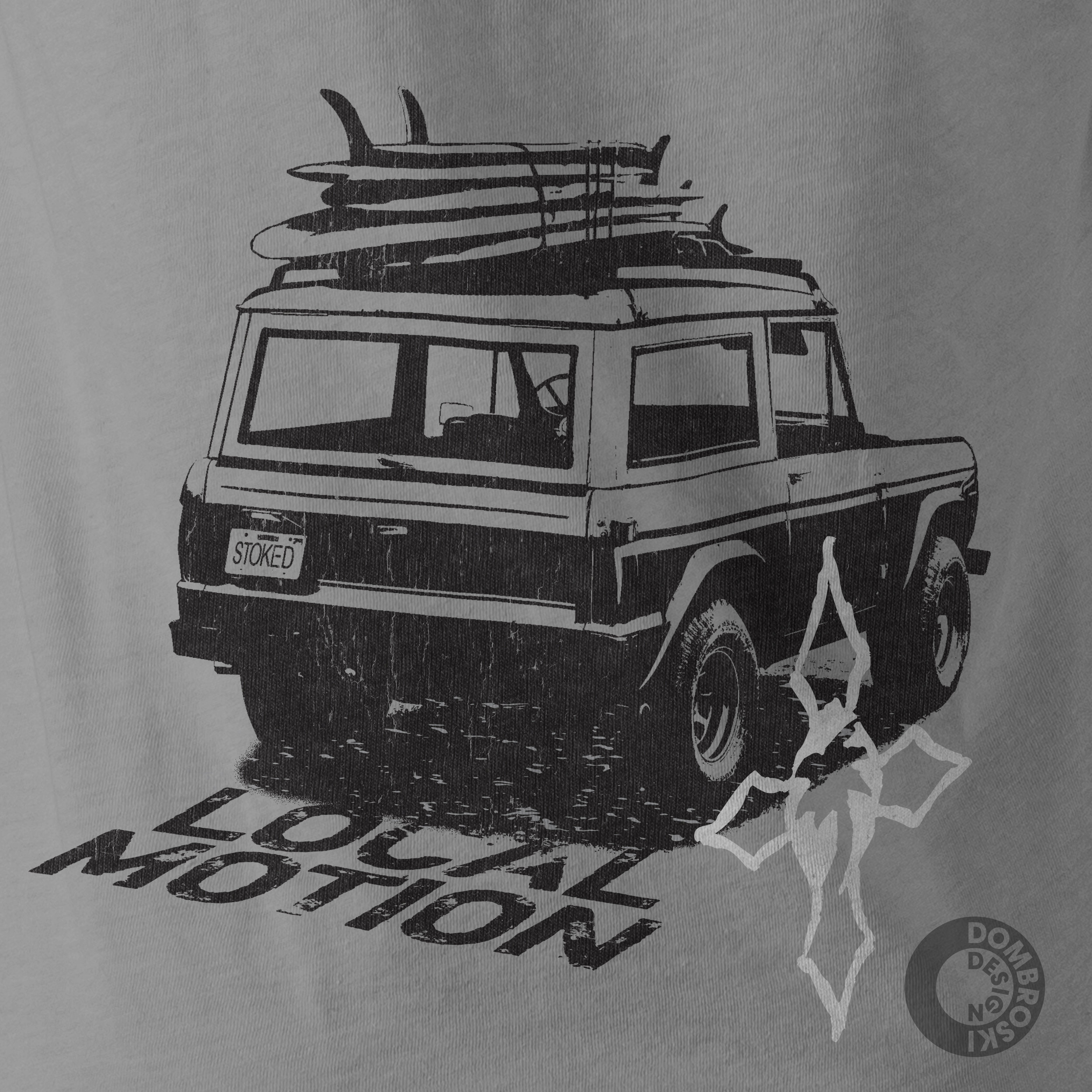
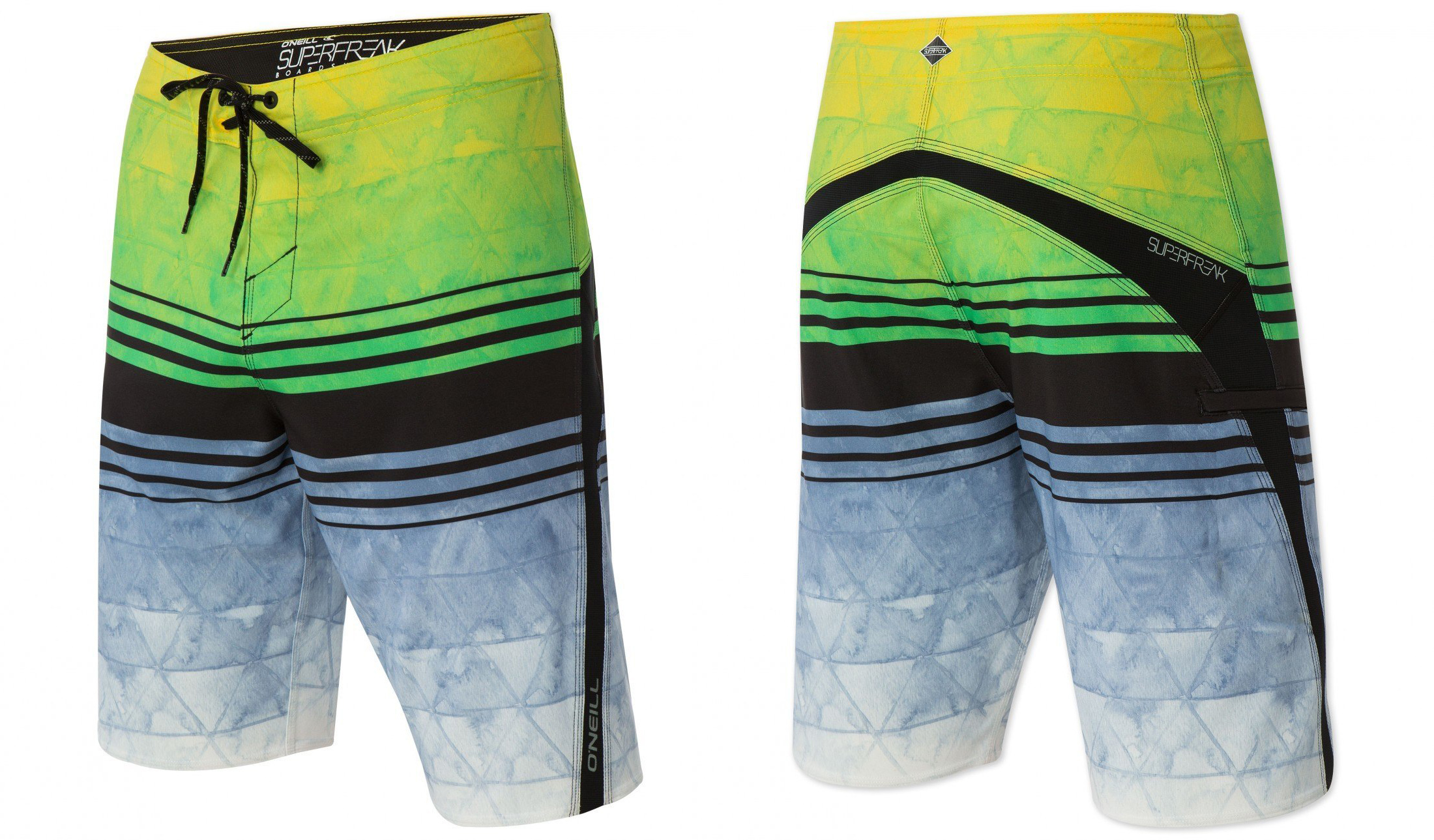
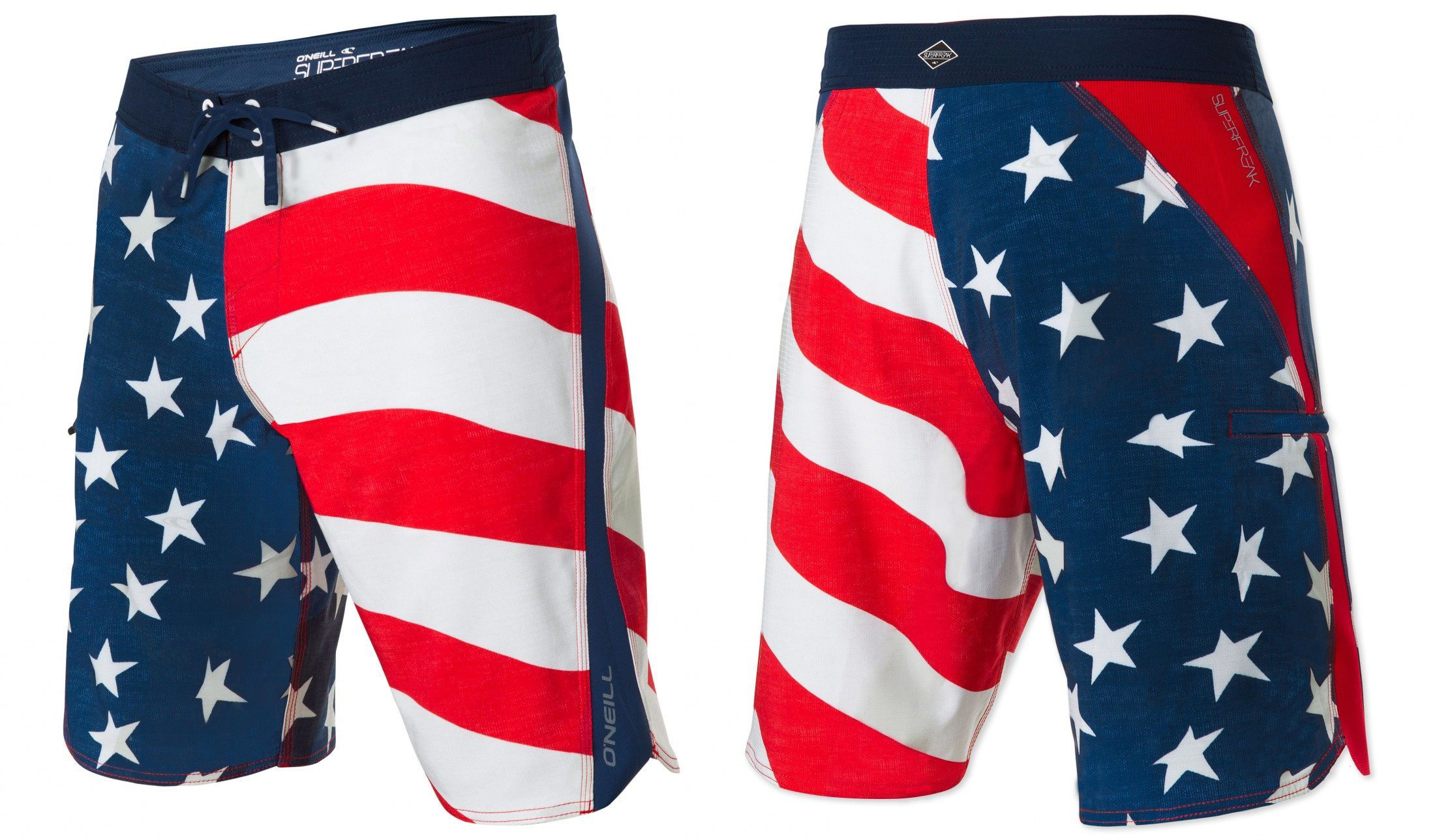
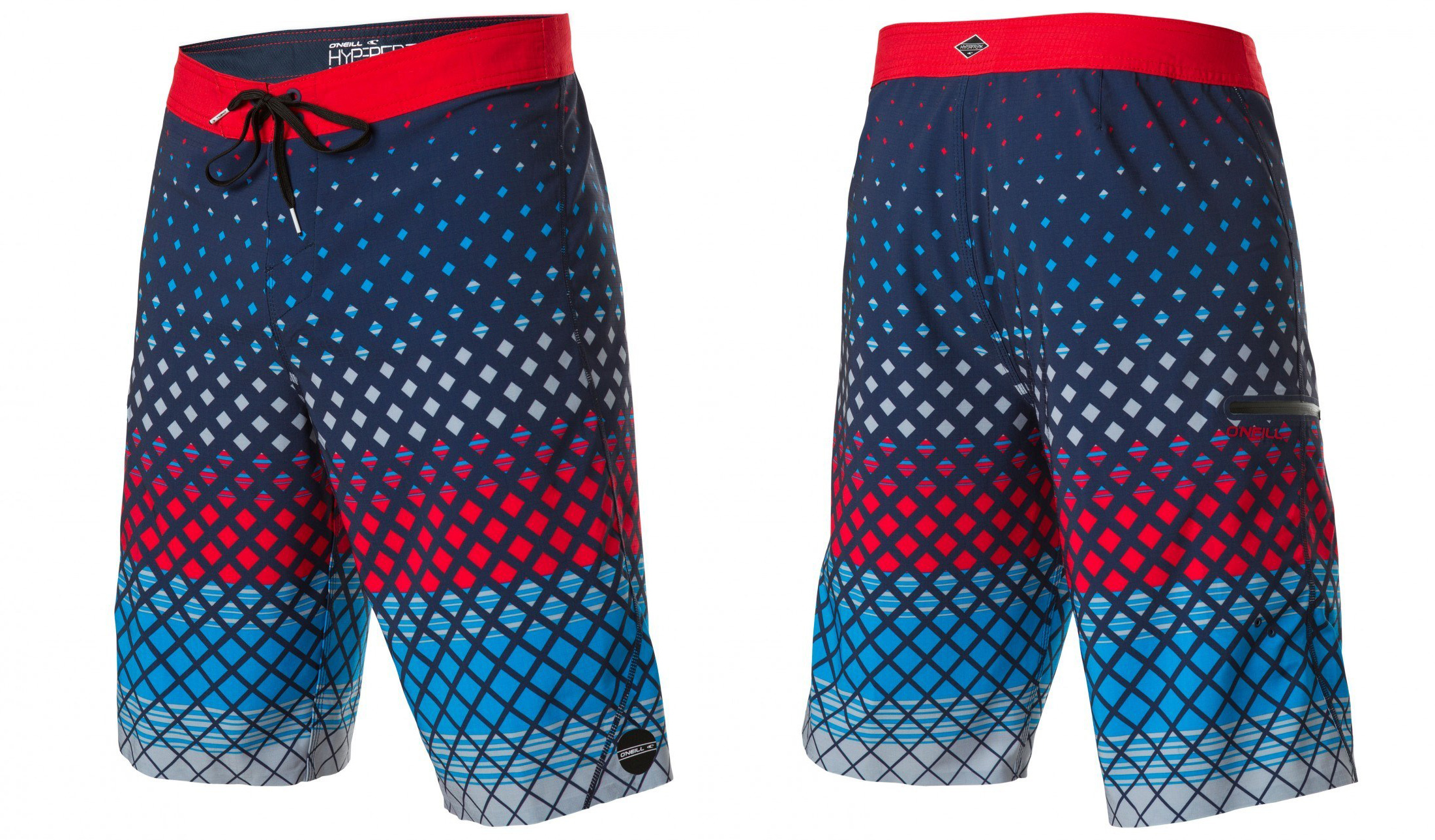
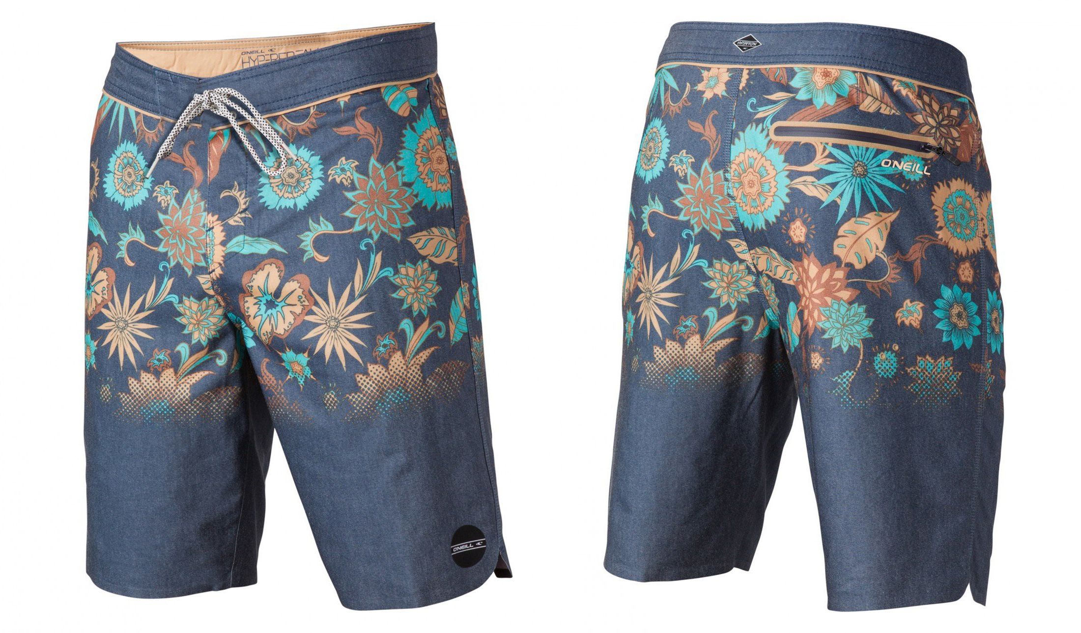
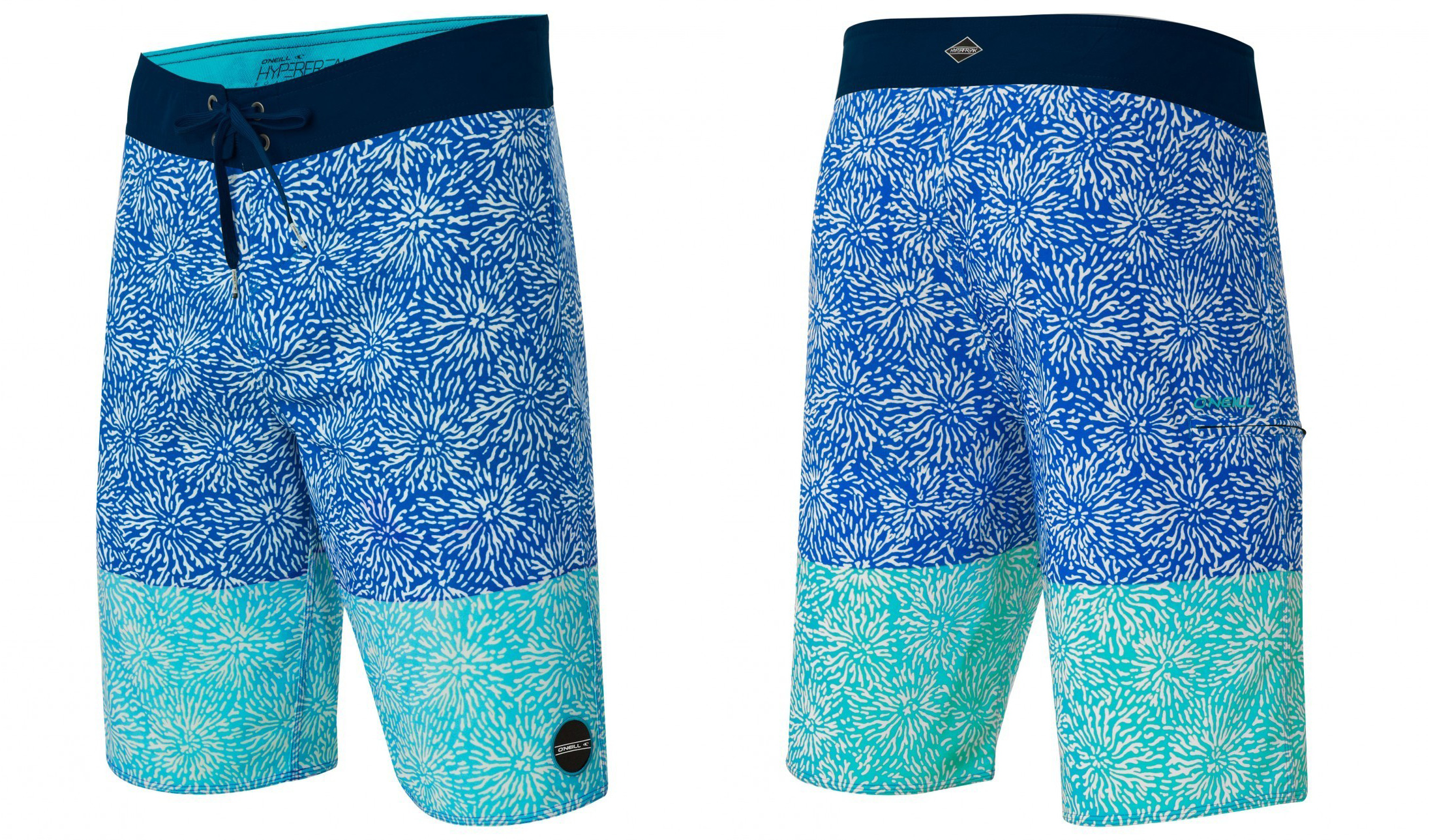
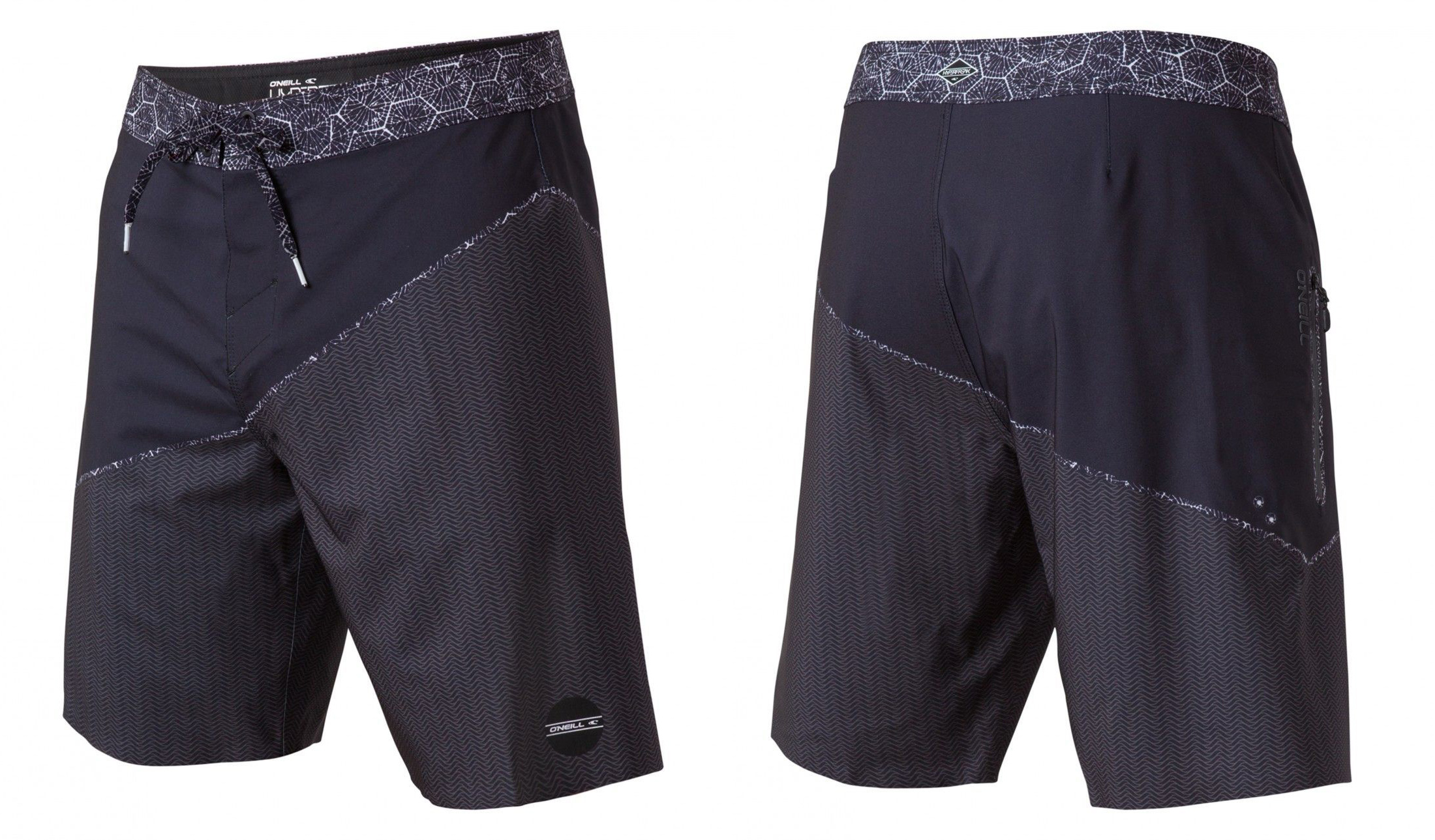
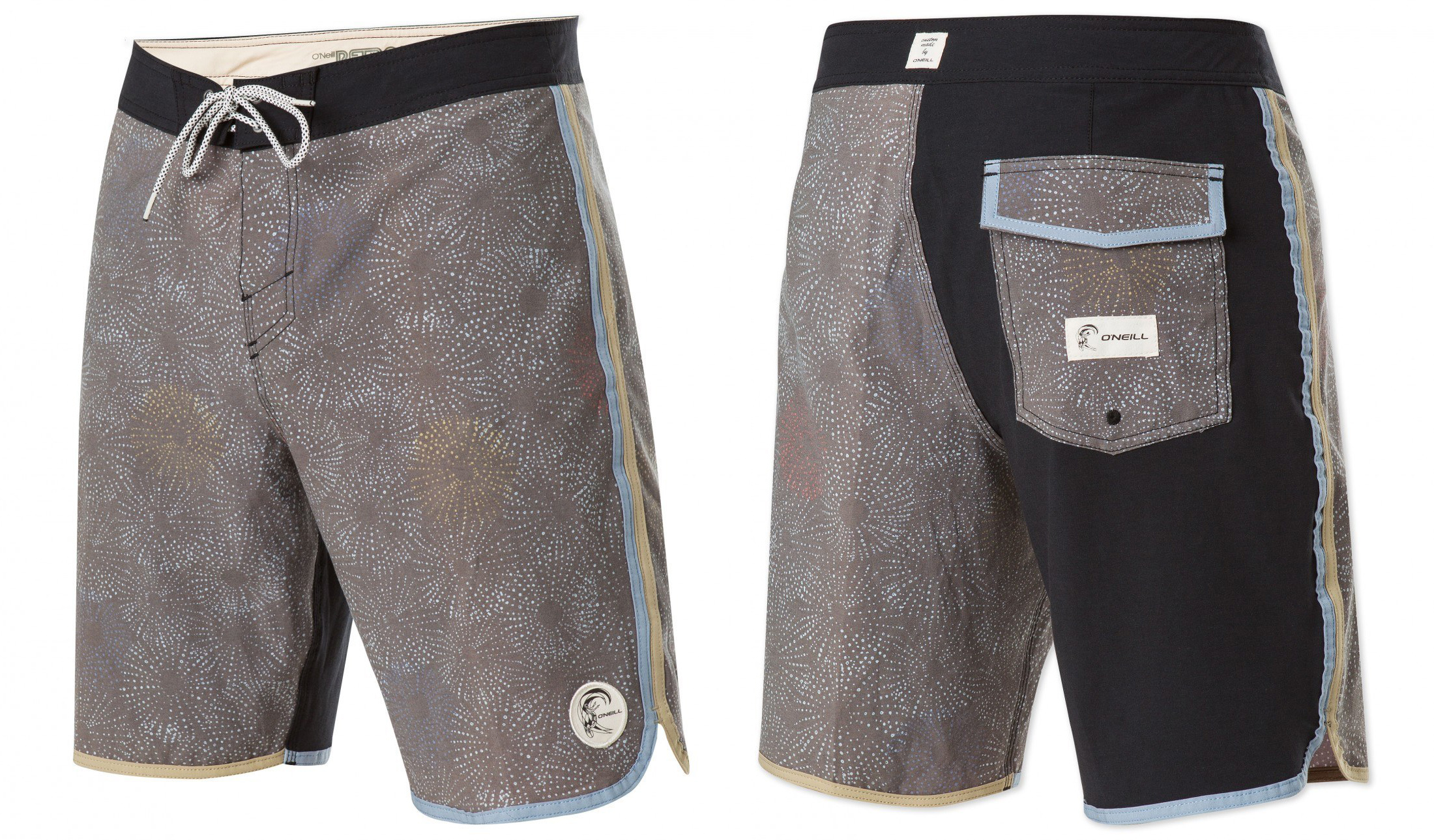
Unless your target company is one of the few that readily asks for and accepts outside art submissions, you will probably need to make your own self-directed project. Design graphics using their branding (t-shirt designs, or a fictional advertisement for example). Whatever you design, it has to be really good. Quality of design needs to be as good as something they would make in-house.

5) Print these designs up in physical form.

If they are t-shirt designs, you could print them onto t-shirts with a hobby screen-printing kit (about $50 from Michaels or Amazon). Or, you could print them out on nice archival paper, like they are big art prints that someone would hang on a wall. The point is to really impress the person opening the package. Make it super easy for them to imagine your designs printed on their products, or in their ads. Your designs should be specifically made for that brand. Sending a hand screen-printed design is way better than an 8.5 x 11 inkjet print because it shows you don't mind putting effort into your craft. 

6) Package everything up and mail it to the Art Director.

Put a note in the package that says "I'm interested in designing for your company. Let me know if you have a need for some design work." Don't forget to put your name, email, and phone number.

7) See if you get a response.

Send the package, and give it a week or so and see if you get a call back. If not, call and see if your person got the package, and if they would be interested in talking. That should get your foot in the door if your designs are pretty good. If it doesn't go anywhere, at least you can put it in your portfolio as a self-directed project to show to other companies.

The point is, avoid what your competition does. Go old-school and call instead of emailing. This isn't a hashtag-filled broadcast for everyone in your Instagram or Facebook feed to see. It's a focused package specifically made for your Art Director contact. Print things oversized, (hand-made, if possible or appropriate) and actually send it in the mail. It takes some effort. But it will get you noticed, because this sort of thing is rare these days. No need to be outlandish or obnoxious. Don't come across as pushy or burdensome. Don't put your contact into a position of doing extra work. Just surprise and delight the Art Director with good graphic designs - this will get you noticed.

~Ray Dombroski

T-Shirt Design Inspiration of the Day

A reverse printed design with hand drawn type and a cool two-color break up. Reverse printing gives a nice subtle look to your t-shirt designs. If you want to know more about this type of screen printing technique (printing on the inside of the shirt) have a look at this recent post on reverse screen printing.

image.jpg

Plastisol Lettering in Progress

I've been sketching up a new lettering design & cover image for a sequel to the popular Plastisol collection of cracked t-shirt ink textures for Photoshop and Illustrator.

The original design (below) is more of a hand-drawn style that doesn't abide by the normal rules of classic lettering design. Not much structure, but it does have flow

I want the new design for Plastisol 2 to retain the spirit of the original, but I want it to be more refined. Here's one of the sketches in the development.

I have a new found love for using tracing paper while creating iterations of lettering designs. The image above is on the path to being more refined, but it lacks a dynamic feeling.

I decided to exaggerate the baseline of the lettering to make it more lively. There are still some proportional problems that I need to address, but here's how it is looking at the moment: 


Plastisol 2 isn't available yet, but have a look at the original Plastisol Collection here.

Learn more about making your own custom lettering design in the Typographic Logos Workshop.

O'Neill T-Shirt Graphics

O'Neill is known as the Original American Surfing Company. It began as a wetsuit company and surf shop, founded by Jack O'Neill in 1952. It continues to be one of the most sought-after surf brands today.

Here's a compilation of some more recent t-shirt graphics.

O'Neill T-Shirt Graphics by Ray Dombroski

New: Vintage Workwear Logo Templates + Vintage Aloha Backgrounds

I've got two new items to show you today. The first is an update to the Vintage Workwear Logo Templates. It's a collection of 25 logo templates that allow you to quickly create and modify your own logo designs in Photoshop or Illustrator.

Each of these templates has two optional layers of distress texture that you can turn on or off.

The templates are all pre-formatted with Adobe Typekit fonts. Most users of the Adobe CC suite have access to these fonts as part of their Creative Cloud subscription.

But if you don't have Typekit, or are using an earlier version of Photoshop or Illustrator, a list of 20 free fonts from around the web (with links!) is included.

Here's a demonstration of how the templates work:

The second item I want to show you, Vintage Aloha Backgrounds, compliments the Logo Templates collection quite well.

To use the Vintage Aloha Backgrounds template, just choose from a selection of 20 tropical images included.

Drop in a vintage logo, or just type some wording with the Photoshop type tool. You can choose from any combination (or none) of the 6 textures that will help your design or type look weathered or vintage to match the background.

Have a look to see how the Vintage Aloha Backgrounds template works:

See the templates in detail:


Option 1: Vintage Workwear Logo Templates (no photo backgrounds)

Option 2: Vintage Aloha Backgrounds (no logo templates)

Preparing T-Shirt Designs with Texture and Transparency for DTG Printing

If you are printing t-shirts Direct to Garment (DTG) with an online service like SpreadshirtTeeSpring, or UberPrints here are some things to know when preparing your art files.

T-Shirt Design with Texture for DTG Printing

Unless your design is a solid rectangle of ink defined by the dimensions of your image file, it will best be prepared with a transparent background. An art file with transparency will also be required if your design has a distress texture (like Plastisol, Time Machine Textures, or Bitmap Textures) that knocks back to shirt fabric color. Otherwise, you may get back a t-shirt with printed ink texture.

Many of these companies accept only a few limited file types. The most universal solution is to send them a PNG file with a transparent background (and transparent texture). A transparent PNG can easily be exported out of Photoshop or Illustrator.

Method 1: Photoshop (Simple)

If you have a flattened one color image, here’s one way you can remove a white background color.

To knock distress texture through your design, the simplest method would be to erase the texture out of your design if you have any Photoshop Brush textures like the ones mentioned above. Just double click the brush files to load them into Photoshop. Select your eraser tool. Select one of the texture brushes from the brush panel. Size your brush using the [ ] bracket keys, and click to erase out the texture. Save your file as a PNG.

Method 2: Layered Photoshop File (Non-destructive technique)

If your Photoshop file is layered, you can group all the layers that you want textured. Highlight that layer group in your layers panel and go to Layer >> Layer Mask >> Reveal All. With that layer mask highlighted in your layers panel, simply paint in black with one of the texture brushes to knock texture through your design.

To see how this method works, skip ahead in this video to the 4:00 mark:

This method is good because using the layer mask makes it nondestructive to your art. Just hide the background layer (if there is one) and save a copy of your file as a PNG and upload it to your t-shirt print vendor.

Method 3: Illustrator Opacity Mask

If you have a background-less design in Illustrator, you will have no problem sending a vector file to be printed. However, if your design includes bitmap or vector textures that go back to t-shirt fabric color, then you will want to use this Opacity Mask method.

Export your art as a PNG anywhere between 150-300 DPI at the printed dimensions that you want. Your exported image will no longer be a vector file, but that's completely fine. 

Tips:

  • When you go File > Export, have the transparency box clicked so your textures become transparent to the background color.
  • When you upload your files, make sure to add your desired dimensions in the notes. Even if, for example, your PNG file is saved as 11" x 6" @ 300 DPI, it doesn't mean the person printing your image will know to print it 11" x 6" on the shirt. I've have found that unless you specify, your t-shirt design will often come back bigger or smaller than you wanted.
  • While you are at it, you might as well specify the placement of your graphic on the shirt. For instance, you could include a note that says "Please place graphic 3.75" beneath collar seam."


Hand Drawn Lettering

I spent part of the day working up a lettering design for a t-shirt using older analog technologies: Pencil, vellum, pigment liner, and marker pen to get the design started.

image.jpg

The design was later refined by using a photocopier, and then ultimately brought into Photoshop. If this design is chosen, it will be in the Fall or Holiday 2017 O'Neill line.

Reverse Screen Printing

Otherwise known as a "push through," a reverse print is when you flip a t-shirt inside out, and print on the inside of the shirt. Some of the ink shows through on the other side, and it results in a natural texture determined by the qualities of the fabric.

You can achieve different looks, depending on the color and thickness of your t-shirt fabric, the color and type of ink, and also how much squeegee pressure is applied.

These are some Quiksilver tees that I spotted out in the store the other day. Notice how the bottom left design used more ink & squeegee pressure for a different effect than the others. On dark shirts, you will typically need more ink and pressure for your graphic to show through, compared to a light t-shirt.

You can reverse print with waterbase ink or plastisol ink. I've even seen reverse printing done with discharge.

Most often, you will want to use water based ink because it will have a softer feel than plastisol ink. Remember, the ink is printed on the inside of the shirt so a softer print is better!

The Ford Bronco is a graphic I reverse screen printed (hand-pulled) in my studio using plastisol ink on a 100% cotton shirt. You can see that more squeegee pressure was applied at the bottom of the graphic versus the top, resulting in a higher density of ink.

You can also print a reverse print with multiple colors. Here's a three-color 4th of July design we made at O'Neill. Reverse printing is good for graphics that would otherwise be too bold if printed normally. The reverse printing "knocks back" the design a bit and makes it more subtle.

Having a more subtle print is also good with men's floral prints. A t-shirt that would otherwise be more appropriate for a pool party, now is turned into a t-shirt you can wear any day of the week.

Why limit yourself to just printing on the inside of the shirt? This was a two-sided print we did at O'Neill.

The palm leaves were reverse printed. Next, the ink was cured. However, I'm not sure if it was put through a dryer or flash-cured on the press (Either method should work).

After that, the t-shirt was flipped back from being inside out, and then reloaded onto the press. Lastly, the O'Neill letters and frame were screened on top.

If you want to screen print on the inside and the outside of the shirt, it needs to be a design that does not require critical registration. You can see the if the O'Neill letters and frame were to float 1/8" in any direction, it would not ruin the design.