I picked up this vintage Jim Morrison t-shirt (black shirt, white ink - top image) at the Rose Bowl Flea Market on Sunday.
The bottom image (white shirt, black ink) has been inverted in Photoshop, and it's a lot more obvious that it's Jim.
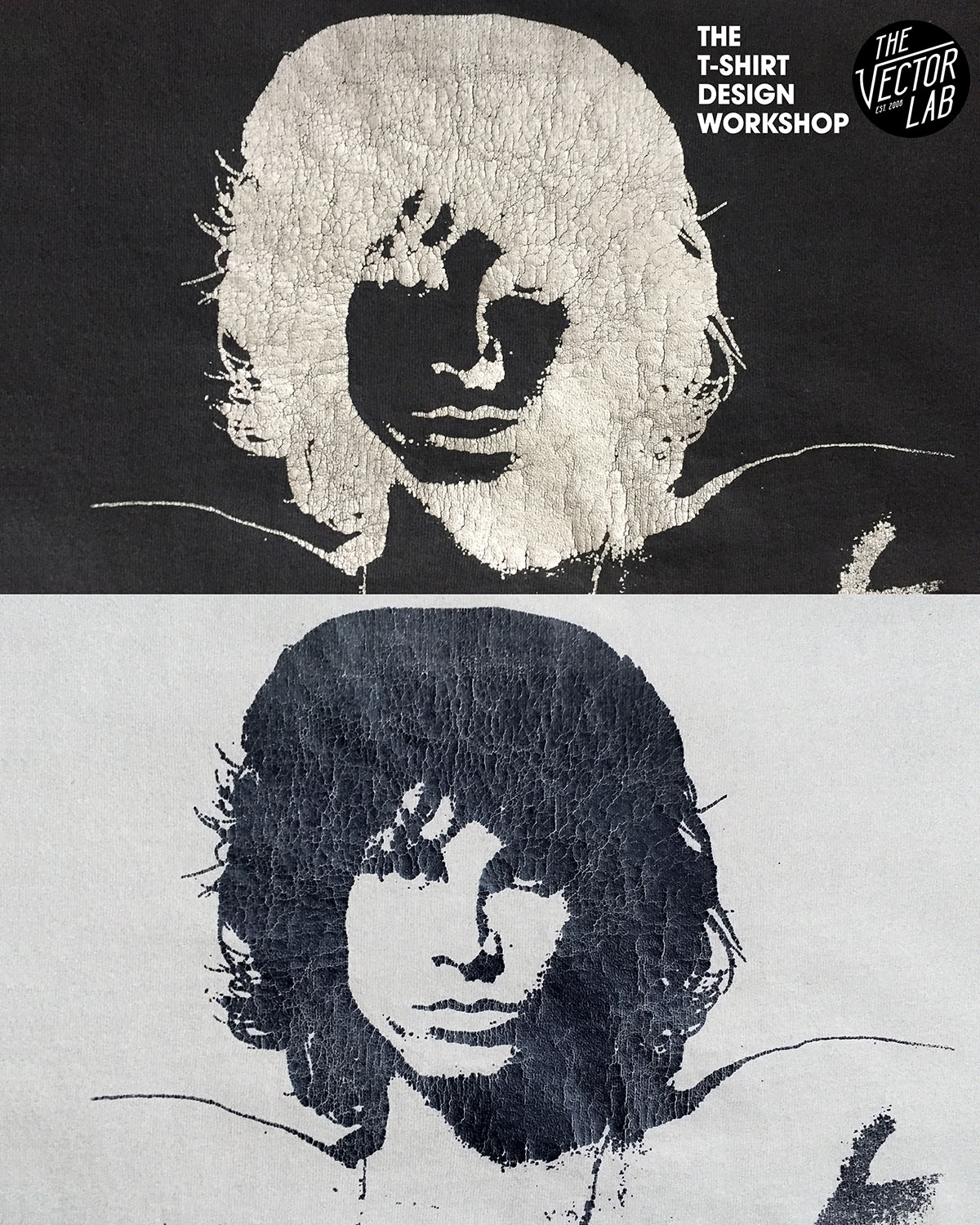
This is a good example of something you will encounter when printing one-color images that were originally designed to be printed with dark ink on light t-shirts. When you are printing one-color photos of faces, cars, etc onto tees sometimes you will get an "x-ray" or uplit look when you try printing that design with light ink on a dark t-shirt.
If you wanted to fix the x-ray problem, you would need to make a new color separation setup for the dark shirts in Photoshop so that the highlight areas of the design (Jim's face) are lighter than the shaded areas of the photo. Essentially, in Photoshop you could create a "baseplate" layer underneath the existing screen, and change the existing ink layer to knock out to shirt color.
But in this case, I think it makes the t-shirt look more vintage and unique.
The cracks in the plastisol ink also add another layer of charm.
By the way, if you are looking to add vintage looking t-shirt ink cracks to your designs, I have some Photoshop and Illustrator textures for t-shirt designers here called Plastisol.
