Using the T-Shirt Squares template in Photoshop.
Introducing "Shop Shirts" - A New Kind of T-Shirt Mockup Template
Just uploaded: a new collection of women's t-shirt mockup templates + 33 changeable backgrounds.
These templates will give your shirt mockups the look of the coolest brands and specialty clothing shops.
Have a look at Shop Shirts: Women's T-Shirt Mockup Templates for Photoshop.
Hula Designs
Hula designs for VOODOO, @aloha_vancouver and another project yet to be announced.

Inspired by 1950’s matchbooks and Hawaii tourism materials. Drawn with the Procreate App for iPad Pro.
A New T-Shirt Brand
Today I'm excited to let you know that I've started a new t-shirt brand called Voodoo Island. (@voodoo_island on Instagram).
The purpose of this brand isn't necessarily to sell a ton of t-shirts.
The reason for the brand is to:
- Have fun and make cool stuff - Hawaii, Bali, and surf-oriented subject matter... with a twist. Lots of fresh lettering & logo designs too.
- Showcase brand new design ideas - Most of the designs I make for big surf brands are a year old by the time they are printed and displayed in store.
- Explore new t-shirt printing techniques - Again, no big-brand restrictions with profit margin or concerns for mass-market appeal.
- Show off real-world results using design resources from TheVectorLab - Want to see what Plastisol Textures or Inside Out Reverse Print Textures really look like when printed onto a shirt? Now you will!
Here's one of the recent designs for Voodoo. The texture for this graphic was applied using one of my favorite tools, the Bad Photocopy Texture Template.

Did you know: Bad Photocopy Texture Template is also part of T-Shirt Design Master Collection, the best deal on the biggest bundle of T-Shirt Design Resources.
That's all for now. If you are interested in seeing more about the new Voodoo Island Brand and also TheVectorLab resources used to make the graphics, you can follow along on Instagram.
All the best,
Ray Dombroski

T-Shirt Design Workshop 3: Using Photos and Type
How Hawaii, surfing, and old cars come together in a freelance t-shirt graphic:
In this one hour workshop, we’ll cover:
How to find and apply inspiration
The various analog and digital tools you will need to create t-shirt designs.
How to move seamlessly between Photoshop, Illustrator, and the Procreate App for iPad so your designs come out as good or better than you had initially imagined
Type layout using Adobe Typekit fonts in Illustrator
How to incorporate hand-drawn effects into a computer-based design
As a bonus you will also receive:
All working Photoshop and Illustrator files demonstrated in this class
A Photoshop texture brush for you to use with your designs
A custom Procreate App brush for you to use with your designs
What are the requirements?
Students should have some prior knowledge of Photoshop and Illustrator. Skills such as how to scan images into Photoshop, an understanding of layers, and how to size images. This is not a basic entry level course for Photoshop and Illustrator.
Curriculum (video lectures)
Introduction (01:23)
Tools and Materials (05:54)
Pinterest (06:10)
Ideation Sketching (02:01)
Starting in Photoshop (19:03)
Adobe Illustrator (18:14)
Procreate App for iPad Pro (11:29)
Ending with Photoshop (07:41)
Wrapping Up (00:47)
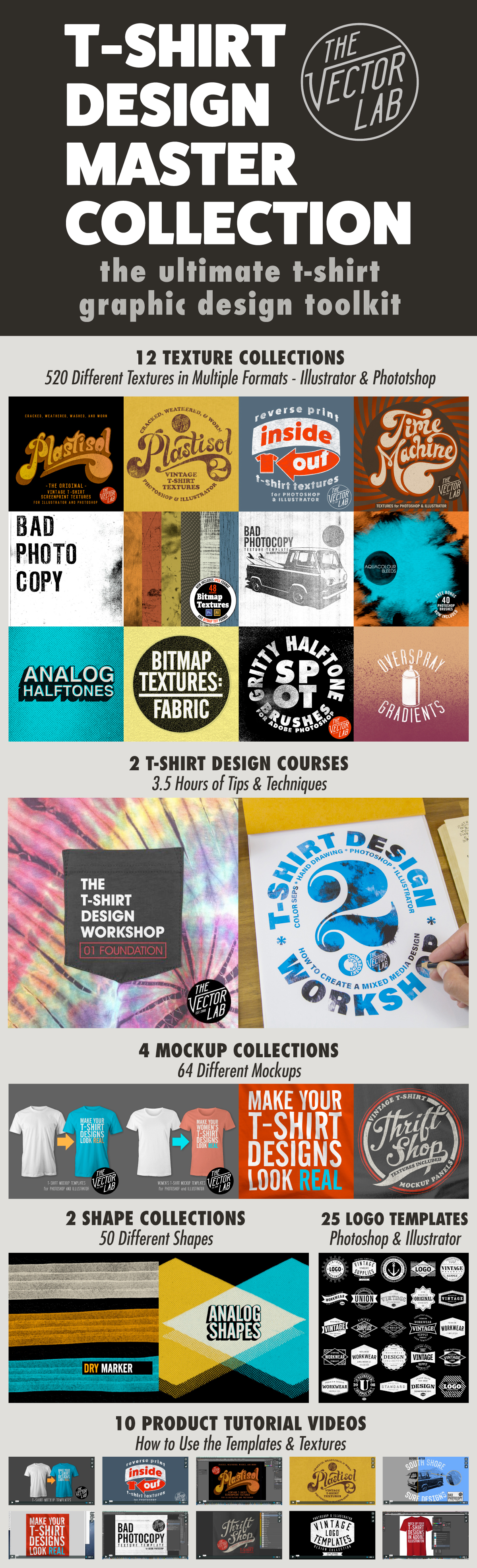
Top 4 Resources inside T-Shirt Design Master Collection
The T-Shirt Design Master Collection is my largest bundle of t-shirt design resources: 64 t-shirt mockup templates, 605 textures for Photoshop and Illustrator, 25 logo templates, as well as T-Shirt Design Workshops 1 & 2.
My favorite resources are:
4) Ink Stamp Automator for Photoshop
Just copy & paste your design into this template to apply an instant ink stamp effect. Perfect for adding some interest to otherwise plain & simple logos or lettering.
3) Plastisol 1 & Plastisol 2 Vintage T-Shirt Textures
These cracked ink "Plastisol" textures will make your t-shirt graphics look washed & worn like and old vintage tee. Plastisol textures are ideal to add a "thrift shop" look to your real-life t-shirt screen print designs, as well as your digital portfolio. Photoshop and Illustrator compatible.
2) Men's T-Shirt Mockup Templates & Women's T-Shirt Mockup Templates
Making your t-shirt designs look real is the best way to show your designs before sending them off to be printed. These templates will help your clients and customers visualize your designs. You can even change the fabric color, add a custom neck label, and warp your graphic to match the wrinkles in the fabric. These templates are formatted for Photoshop and Illustrator, but also work with CorelDraw and Affinity Designer & Affinity Photo.
1) T-Shirt Design Workshop 1 & T-Shirt Design Workshop 2
Learn how to design a t-shirt like a pro. More than 3.5 hours of t-shirt design theory & instruction
Tutorial: Add Texture to Graphics in Adobe Illustrator - The #1 Method
This video shows how to use Opacity Masks in Adobe Illustrator to add texture to your t-shirt designs, logos, and lettering. It also covers how to export your design as a transparent PNG, which is a preferred file format for Direct-to-Garment (DTG) printing, Print-on-Demand (POD), and Amazon Merch.
Resources discussed
In case you missed it, here's a video showing how to use textures, layer masks, and brushes in Adobe Photoshop.
Fishing T-Shirt Designs
T-shirt designs for some salty fishing & surf brands!
Tools used: Adobe Illustrator, Adobe Photoshop, iMac, iPad Pro, Apple Pencil, Procreate App, Ink Stamp Automator, T-Shirt Design Master Collection.
Plastisol Cracked T-Shirt Ink Textures
Make your t-shirt designs look washed & worn with Plastisol Textures for Photoshop and Illustrator!

What is Plastisol, and what does it have to do with Vintage T-Shirts??
Plastisol Ink is a type of Screen Printing Ink that was first used to screen T-Shirts in the 1970's. When you look at Vintage Clothing, it's the ink that cracks and flakes over time as the t-shirt gets washed, stretched out, and worn to too many Def Leppard concerts.
Plastisol is why real Thrift Shop T-Shirts look Vintage!

How easy is it to add vintage texture to your own designs? Have a look at the tutorial videos.
PHOTOSHOP PSD: The most versatile format. Power users can easily go in and adjust the textures to their liking.
BITMAP TIFF: Use the "Opacity Mask" method (shown in the Plastisol 2 tutorial) to knock transparent texture through your raster & vector designs in Adobe Illustrator (yes Illustrator)!
PHOTOSHOP BRUSH: Super easy to use. Just double-click on the .abr file and these brushes will load into your Photoshop Brushes Palette. Select a brush, and click to paint in your vintage texture!
So what's the difference between Plastisol 1 and Plastisol 2?
The short answer is Plastisol 1 Textures are FASTER. Plastisol 2 Textures are highly CUSTOMIZABLE.

Open for Business
Dombroski Design, Inc: Logos, lettering, and surf t-shirt designs.

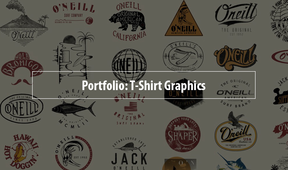
Recent Graphic Design Work


T-Shirt Design Master Collection
Here is a visual reference of all the resources included in T-Shirt Design Master Collection. At only $79, it is by far the most complete collection of textures, workshops, tutorials, textures, and templates ever offered on TheVectorLab.
Holiday in the Islands
"Haole Days" Collection - a Hawaiian Christmas themed design for O'Neill clothing.
Here's the print for boardshorts and woven shirts:
A closeup view: Santa wrestling a shark.
Aloha shirt.

Boardshorts
T-Shirt Design

Inside Out: Reverse Print T-Shirt Textures
Otherwise known as a "push through," a reverse print is when you flip a t-shirt inside out, and print on the inside of the shirt. Some of the ink shows through on the other side, and it results in a natural texture determined by the qualities of the fabric.

With "Inside Out" Reverse Print Textures, you can achieve the look of a real reverse screen print, without the headaches, ink thickness, and inconsistent results of traditional reverse printing.
What's included:
17 Textures: 4000 x 4000 pixels (equal to 13.33" x 13.33" @ 300 pixels per inch)
Every texture is in seamless repeat (tileable top-to-bottom and side-to-side), so you can use them to texture ANY size graphic.
These textures can be inverted (see video), essentially giving you 34 texture options!

Each of the 17 textures comes in the following formats:
• Photoshop Brush. Just double click on the .abr file to automatically load the brushes into Photoshop!
• Photoshop PSD with transparent backgrounds. (These files also include a hidden flattened layer for advanced users who want to adjust the "levels" of the lights and darks.)
• Bitmap Tiff. These files are ideal for screen print production & color separations using Illustrator because they have no greyscale; only black or white pixels. When viewed in Illustrator, Bitmap Tiff files have automatic transparency and can easily be assigned any color.
3 ways to get Vintage Cracked Ink Texture for T-Shirt Graphics
As a t-shirt designer there are 3 ways to get a vintage cracked ink look for your graphics like this:

- Print a t-shirt. Repeatedly wash & wear the shirt for 10 years.
- Use a crackle ink to print your design. It's good to give it a wash before selling so that the cracks will become more visible.
- Use the "Plastisol" collection of Photoshop Brushes and Bitmap Textures to add a consistent & reliable vintage look to your designs.
--
You might enjoy the Plastisol Textures Collection because 10 years is a long time to wait for t-shirt ink.
T-Shirt Design for Pointer Brand and LC King
I recently had the opportunity to design a t-shirt for LC King, makers of Pointer Brand Clothing.
If you haven't heard about LC King and Pointer Brand, it's time for a closer look.
Founded in 1913 by Landon Clayton King, it is the oldest family owned & operated clothing factory in the USA. The factory in downtown Bristol, Tennessee has been in the hands of the King family for more than 100 years and four generations.
Here's the design for the back of the shirt:

And for the front of the shirt, it's a simplified version of the main design:
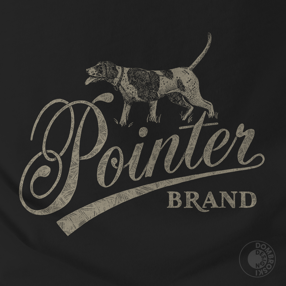
When I design t-shirt graphics, I almost always design a version for light fabric and a version for dark fabric. This helps the client visualize how the design will look.
It also helps me to pick ink colors. As well as foresee potential issues with screen printing.
If you examine these cads, you will notice how the dog art needed to be "flipped" so that it didn't have the "x-ray" effect. This can be a problem when printing one-color designs.
Here's the spec sheet for the design on white:
And here's the spec sheet for the design on black fabric:
They ended up printing the design on a black t-shirt (good choice!).
This tee is exclusive to the factory store in Bristol. It's not online. Go say hello and see the tradition / American made heritage / pride / workmanship for yourself.
Read more about LC King here.
--
If you are interested in designing t-shirts, have a look at my T-Shirt Design Workshop 2 - because you should never stop learning!
~Ray Dombroski
Pivotal graphic in my design career
In 2005, I cold-pitched this design to Local Motion in Hawaii. They bought it, along with a few other graphics.
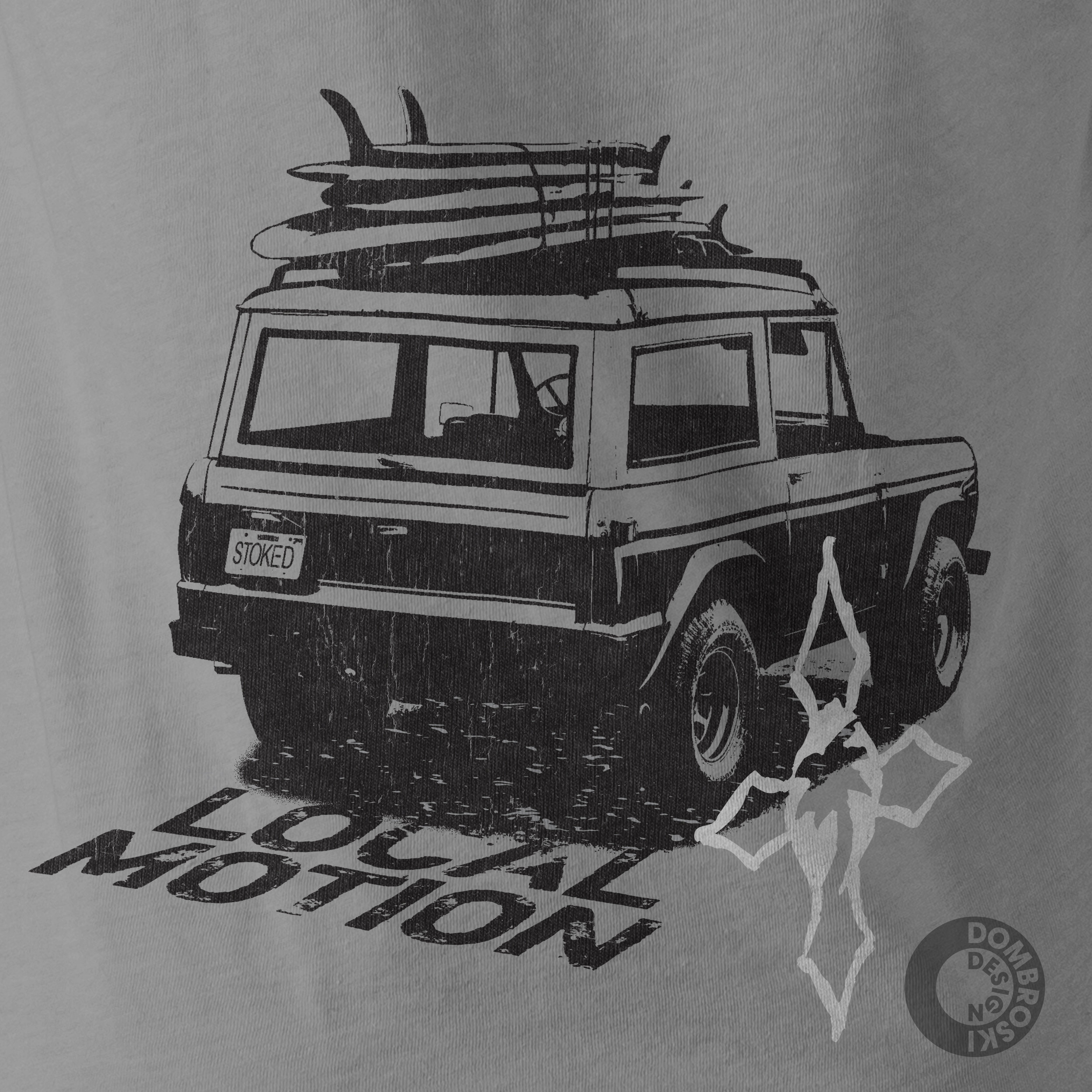
All of a sudden, all my trips to Hawaii were business write-offs. This led to me doing more graphics for other Hawaiian surf companies like T&C and HIC.
Billabong hired me because they needed someone to help out with Hawaii and destination tees and in-line designs. Then this eventually led to doing work for O'Neill, as well as a lot of other designs I've made in the surf industry.
This graphic was made from a crappy snapshot of an old ford bronco that I spotted in Ala Moana Beach Park. I plan to do a design tutorial soon showing how to make t-shirt graphics using this method.
The thing I like about this design is it still looks fresh. How about a reissue? I still have the Illustrator file.
How to present your t-shirt designs just like the big apparel brands
Have you ever stopped to notice how big apparel brands like Nike, Topman, and Quiksilver display t-shirts and apparel on their websites and in their catalogs?
Often they are photographed on a mannequin with great studio lighting.
The studio background, along with the mannequin neck and arms have been erased from the image. The inside portion of the collar and neck label have been Photoshopped into the image to complete the look of the shirt.
This kind of image emphasizes the graphic design, fabric color, and shape of the garment itself.

If displaying apparel in this manner is being done by these big companies, then there must be a reason. Right?
Perhaps they have discovered that this is the most effective way to appeal to their customers.
I have always been of the opinion that the better the PRESENTATION of your designs, the higher likelihood you will increase your sales.
This is why my apparel templates have been photographed in a similar way. On mannequins in a studio with proper lighting.
In addition, the templates have been set up with the ability to easily:
- Add in your graphic
- Change the fabric to any color
- Warp your graphics to match the shape of the shirt wrinkles for extra realism (Photoshop only)
- Mock up front views and back views
- Add in your own custom neck label design
- Use with Photoshop and Illustrator
- Crop the edges of oversize graphics to the shape of the shirt
- Choose regular cotton or heather texture (like poly-cotton or tri-blend fabric)
- Display over any background image or color (the backgrounds are transparent)
- Add in a pocket (select templates)
If you are a graphic designer or have a business that sells t-shirts, I believe that my mockup templates are the fastest, easiest, and best looking way to make your designs look real. Just as if your designs were photographed in a studio with professional cameras and lighting.
Now you can get ALL of my men's mannequin-style mockup templates in one brand new bundle, for more than 50% off!
This includes all 113 mockup templates for:
- men's short sleeve tees
- v-necks
- tank tops
- zip & pullover hoodies
- crew neck sweatshirts
- long sleeve thermals
- polos
- raglan baseball shirts
- long sleeve tees
Each style of shirt in this bundle has multiple images, photographed with the same camera angle and lighting so they look consistent on a page. But each one has a slightly different shape so it's not apparent that they are mockups.

What I learned as a design student
When I was a student at Art Center College of Design in Pasadena, one of the things I appreciated was that the instructors were required to also be working professionally in their chosen fields of design.
I felt this added credibility to what the instructors taught. As a student, you could be assured that the instructors' teachings were relevant to current design trends and met realistic design constraints & capabilities.
I try and do the same with my own business & teachings by designing for companies in the real world.
As some of you know, in addition to running TheVectorLab and teaching Graphic Design Workshops, I also design t-shirts and prints for the surf apparel industry.
I recently updated the blog with some graphic designs from my personal portfolio. I hope you enjoy!
Ray Dombroski

Plastisol: Cracked Ink Textures for T-Shirt Designs
How do graphic designers get a vintage cracked ink look for their t-shirt designs?
It starts with Plastisol Ink.
Plastisol Ink is a type of Screen Printing Ink that was first used to screen T-Shirts in the 1970's. When you look at Vintage Clothing, it's the ink that cracks and flakes over time as the t-shirt gets washed, stretched out, and worn to too many Def Leppard concerts.
I've wandered through thrift shops, vintage clothing stores, and flea markets to gather only the best t-shirt specimens. These t-shirts with aged, worn, and washed cracked ink were then scanned into the computer. The scanned images have been turned into a collection of textures (bitmaps, JPEGs and Photoshop Brushes) that you can use to make your own t-shirt designs look vintage.
This collection of textures has been named "Plastisol"

This collection has 10 different 'base' textures, each with a Light, Medium, and Dark version. The "Dark" textures are the most beat-up, vintage, and abused. The "Light" textures have less weathering or "distress."
Each of these 30 Textures comes in the following formats:
• Medium-Resolution Photoshop Brushes (1500 x 1500 pixels - for ease of use and web-oriented graphics)
• High-Resolution Photoshop Brushes (2500 x 2500 pixels - maximum brush size for older versions of Photoshop)
• High-Resolution Photoshop Brushes (3000 x 3000 pixels - for real t-shirt graphic production or high-res graphics)
• Photoshop PSD (3000 x 3000 pixels - flattened greyscale files)
• Bitmap Tiff (3000 x 3000 pixels - these files are the ones you use in Illustrator)
(Please note, there are no vector files in this collection. Use the Bitmap Tiffs in Illustrator for much more detailed texture that won't bog your computer down).
My favorite versions are the BITMAP TIFF files and the PHOTOSHOP BRUSHES!
BITMAP TIFF: The white areas in these textures will be transparent when you place them into your Illustrator files (yes Illustrator!) on top of your vector graphics. Color these the same as your background, so it looks like the background is coming through your graphic. This method of adding texture is an old-school trick used by all the veteran t-shirt designers out there.
PHOTOSHOP BRUSH: What can I say... these are super easy to use. Just double-click on the .abr file and these brushes will load into your Photoshop Brushes Palette. Select a brush, and click to paint in your vintage texture!