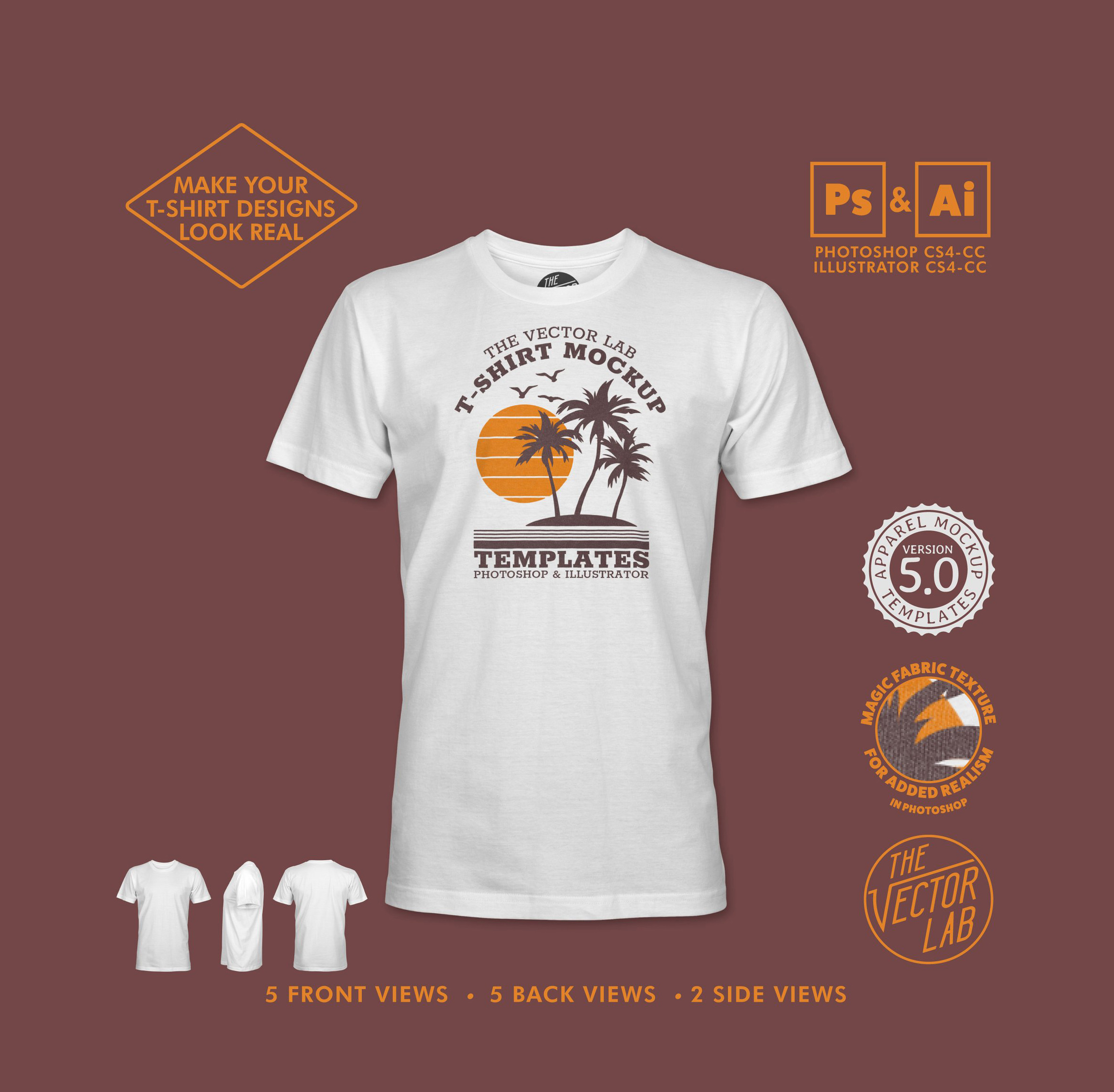
Mock Up Your Men’s T-Shirt Designs and Make them Look Real
User Guide
Tutorial Video
Instructions
1) Open your Layers Panel. (Window > Layers)
2) Drop down layer groups so you can see all the layers. (> arrows)
3) Double click “Drop Shadow” to adjust the drop shadow effect. You can also turn off the visibility (eyeball icons) if you don’t want a drop shadow.
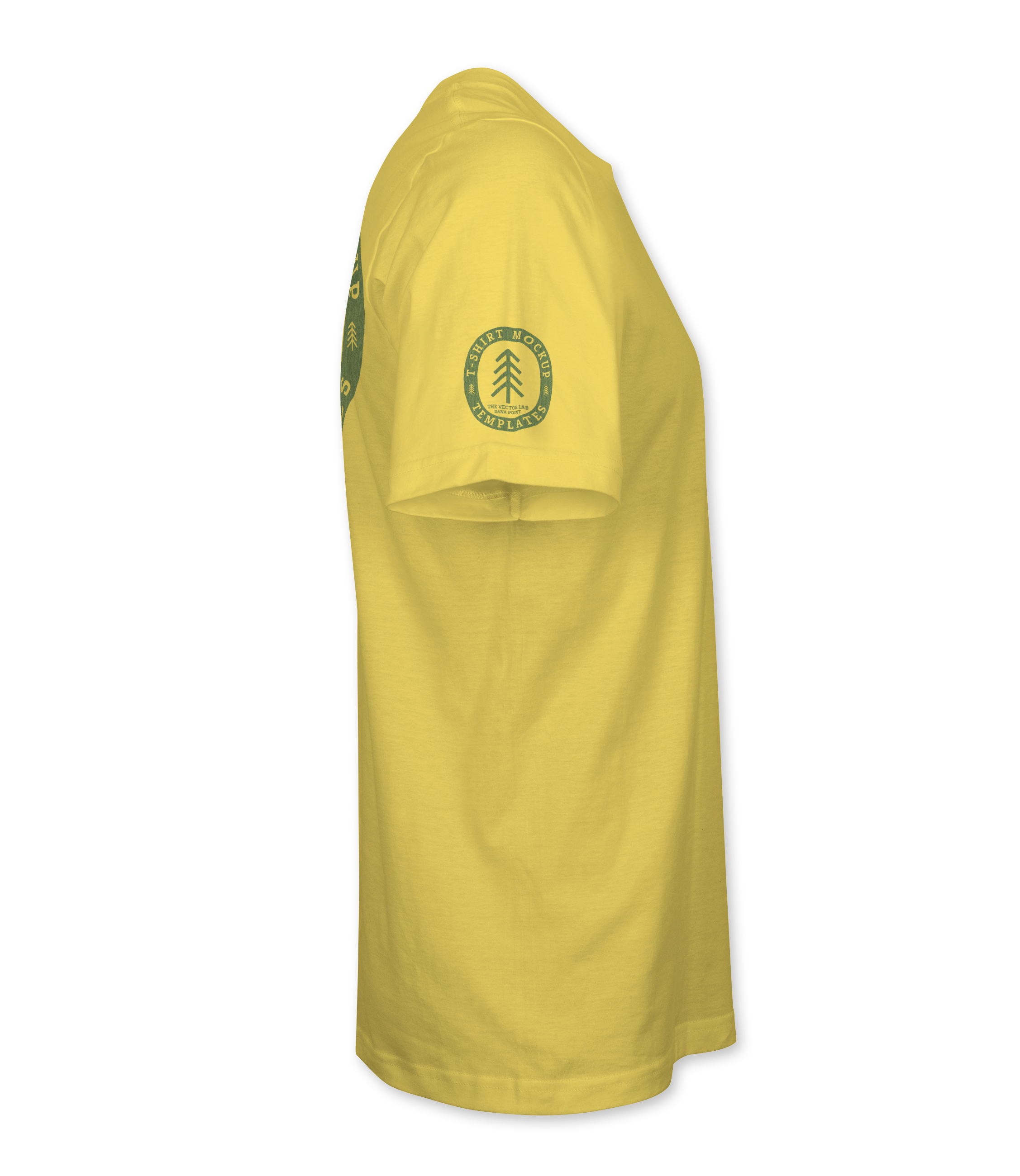
4) Double click this thumbnail in the “Fabric Shading Contrast” layer to increase or decrease the lighting & shadow contrast.
The “Properties” window will open.

5) In the Properties window, you can adjust these sliders to non-destructively add or remove contrast to the fabric shadows.
For colored and darker shirts, you can move the leftmost slider to the right until you get the right amount of darkness in the shading. Adjust the sliders to where the contrast looks good to your eye. There’s no right or wrong answer here. If the shirt looks dirty or dull, increase the brightness of the highlights by moving the rightmost slider to the right.
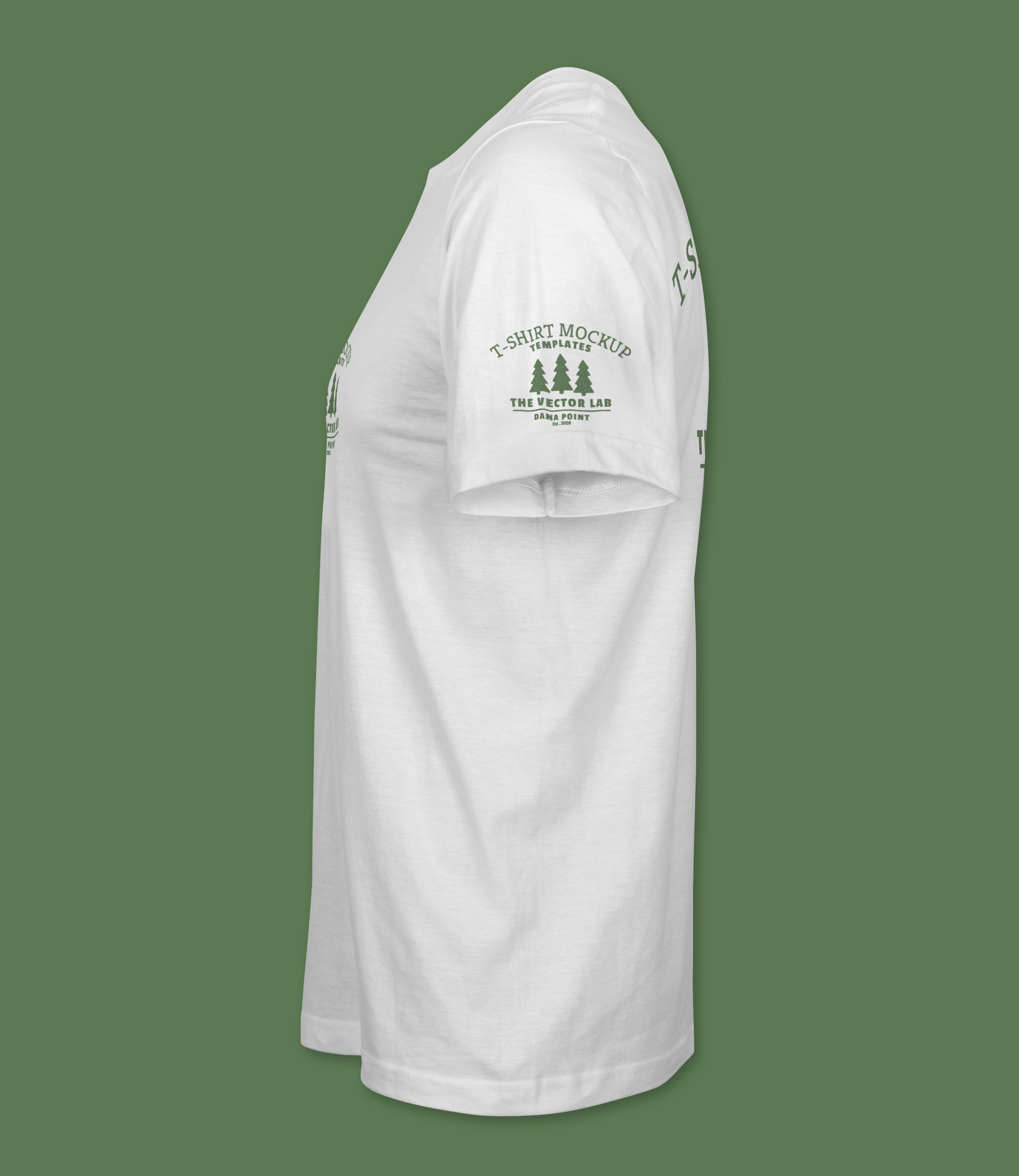
NECK LABEL
6) Highlight this layer by clicking on it.
7) From another Illustrator or Photoshop file, copy & paste in your own neck label art.
8) Hide the visibility of the old neck label art. (eyeball icon)
9) Your neck label art will be automatically cropped inside the collar opening. If your neck label art isn’t visible, make sure to move it up into the collar area.
10) Double click this thumbnail in the “Pocket Shading Contrast” layer to increase or decrease the lighting & shadow contrast.
11) Double click “Color Overlay” to change the pocket fabric color.
YOUR ART (Here’s where it gets fun)
12) Turn on the visibility of the Magic Fabric Texture layer to apply a super subtle fabric texture to your design. This simulates a light print (not thick ink) where some fabric color shows through.
You can also edit the OPACITY of the Magic Fabric Texture layer at the top of the layers panel. This will increase or decrease the effect. Default opacity is set at 75%. But 50% also looks great. Turn the visibility of this layer off if you are going for a super bright / thick ink look to your print.

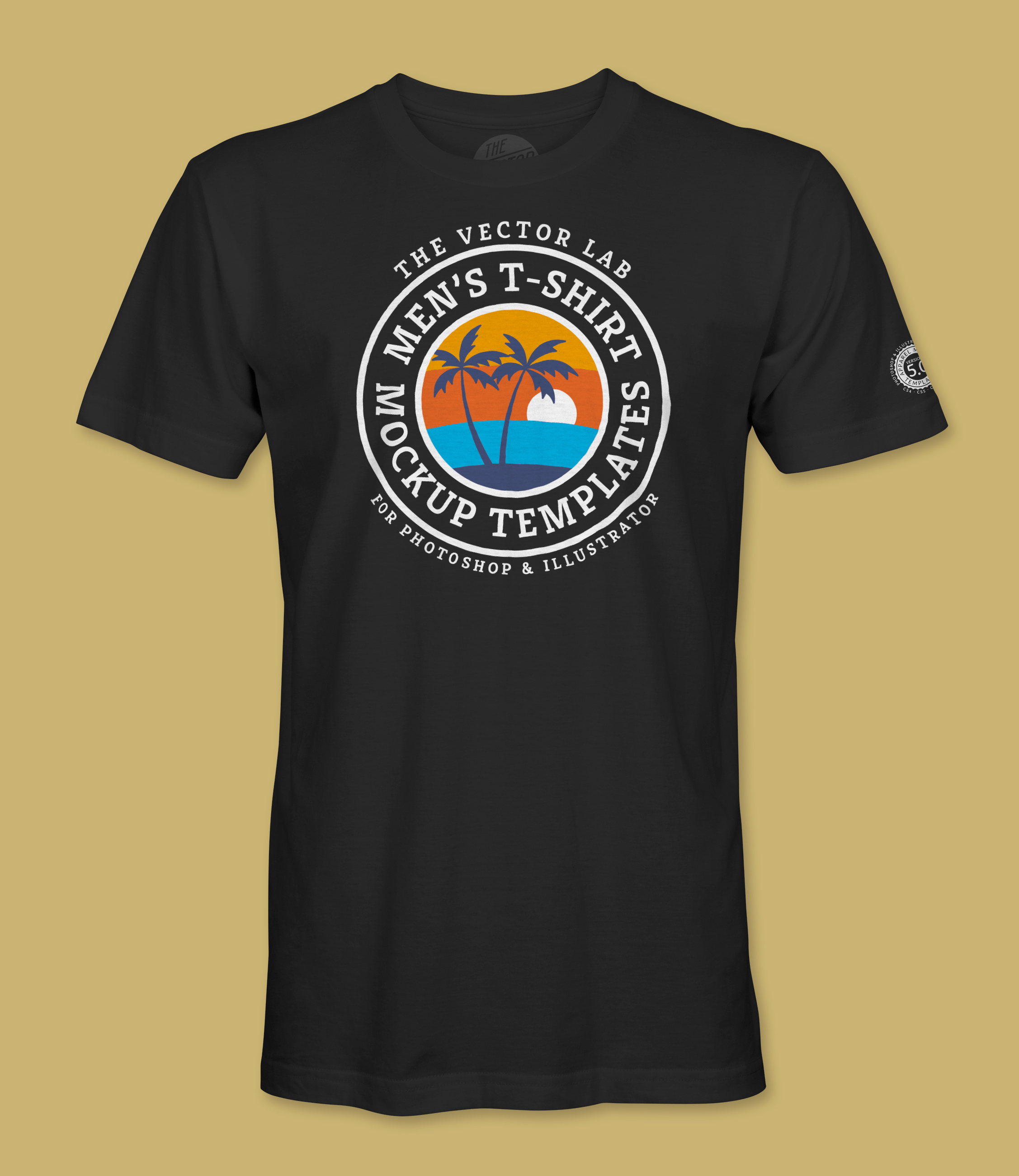
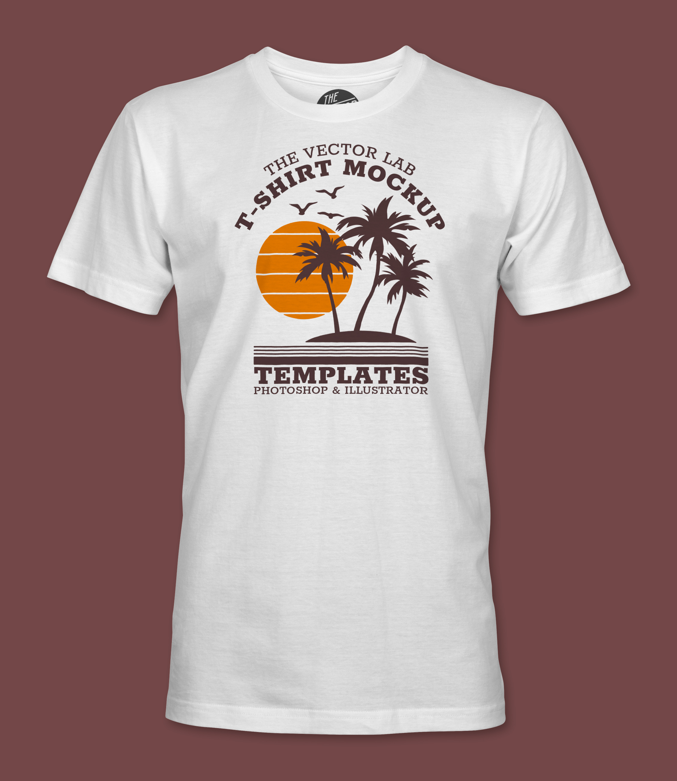
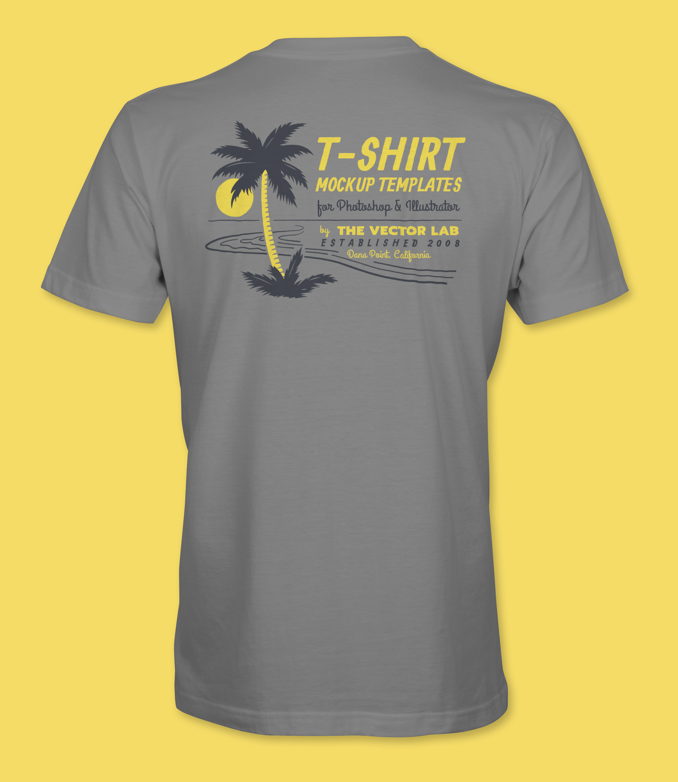
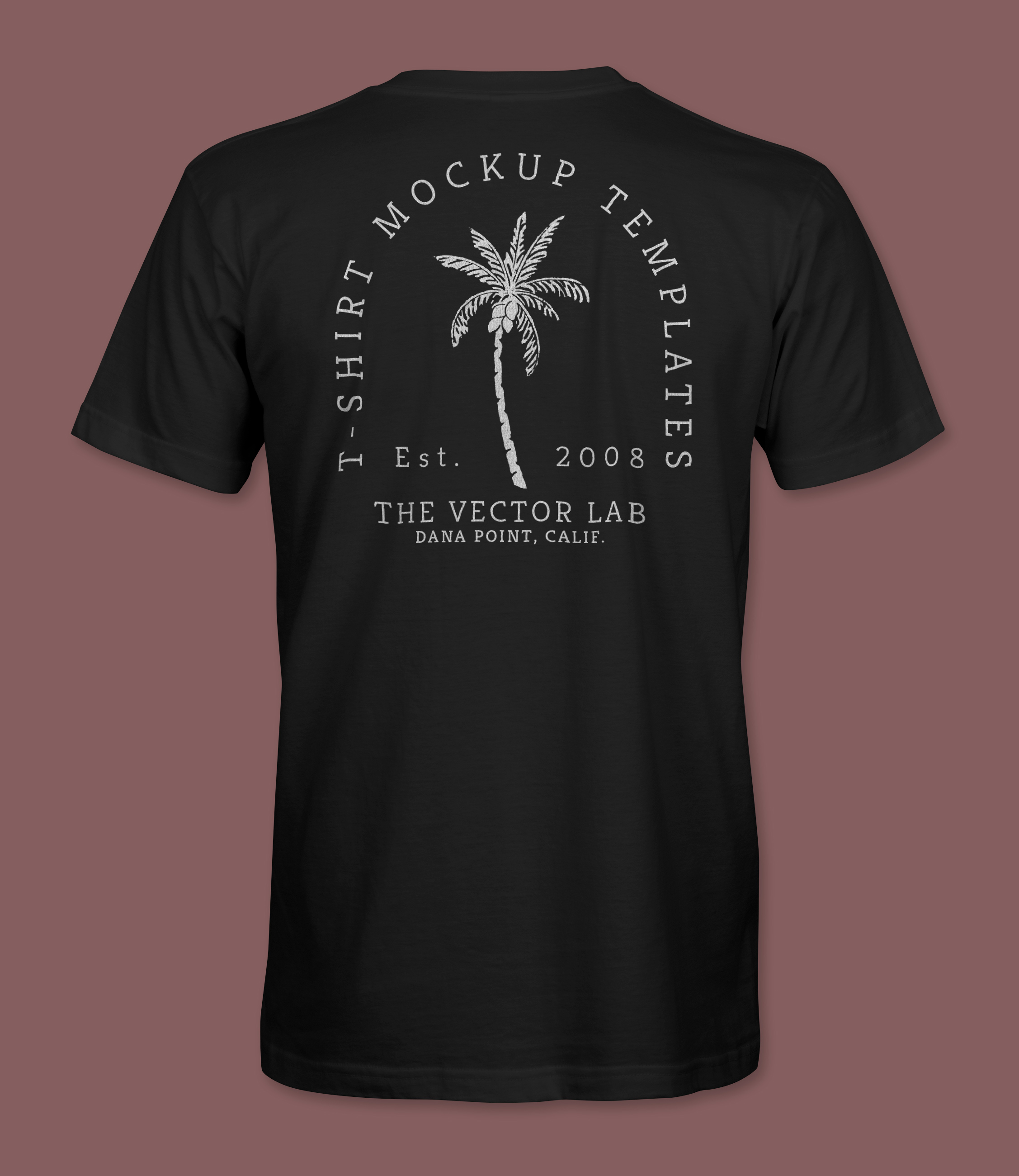
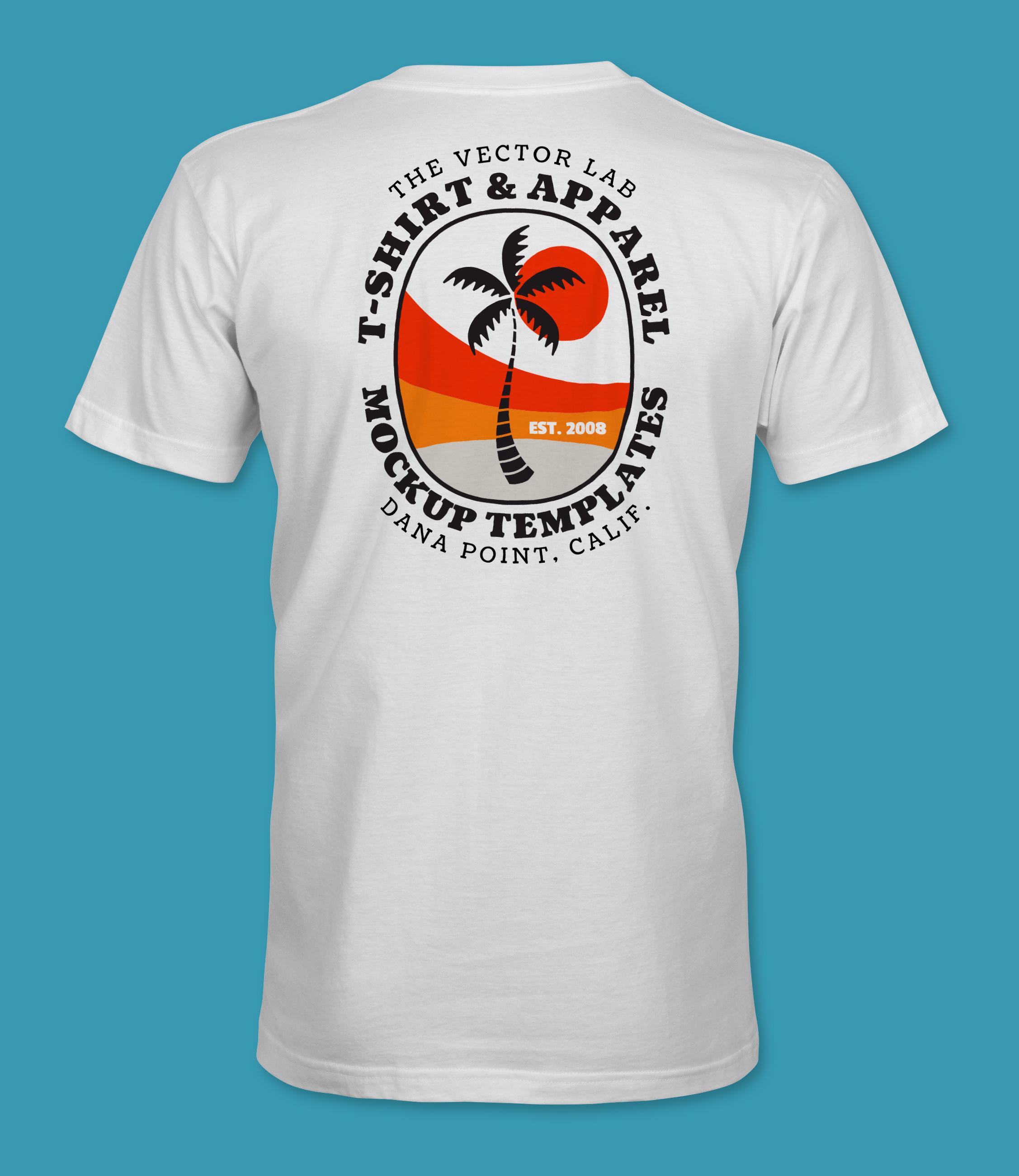
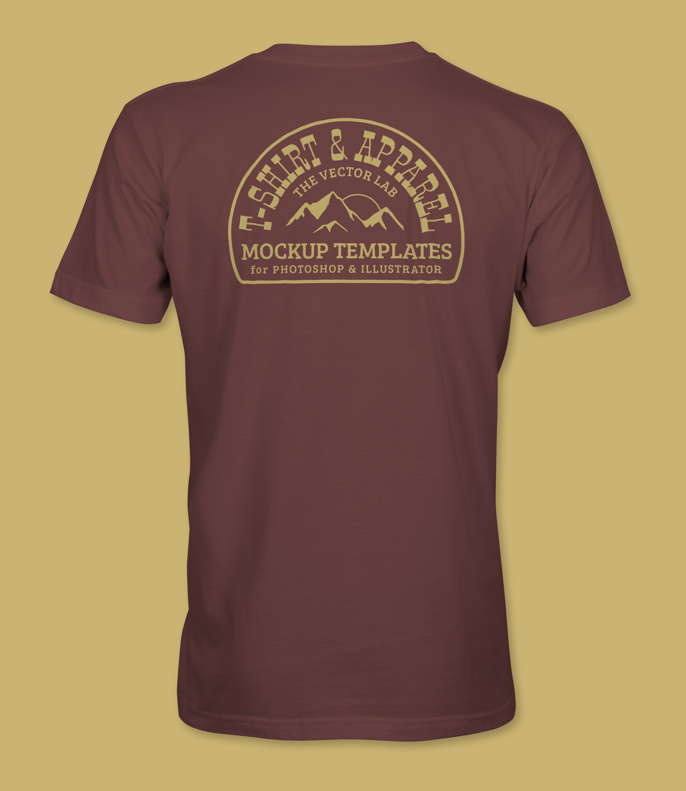
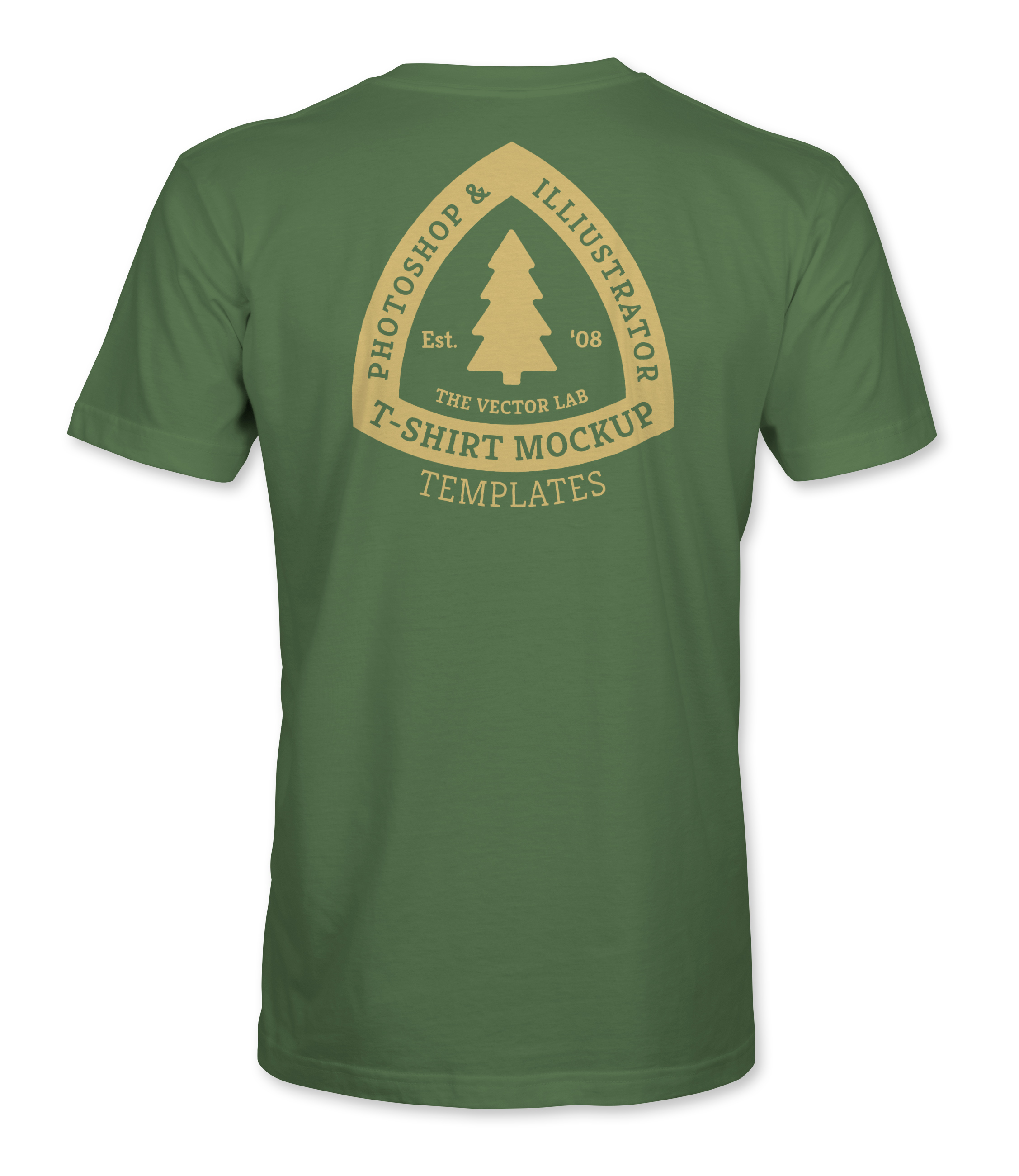
13) Turn off the visibility of the Example Graphic layers. This is to show sizing and placement. All of the Example Graphics were made with Logo Design Master Collection, which is a separate bundle of logo-style t-shirt graphics for Photoshop and Illustrator.
14) Highlight this layer by clicking on it.
15) From another Illustrator or Photoshop file, copy & paste in your own neck label art.
16) As shown in the tutorial video, you can apply a DISPLACEMENT MAP to your art layer to warp your graphic to match the shape of the fabric wrinkles. If this doesn’t give you the results you want, you can also try using the LIQUIFY filter (Filter > Liquify...) in Photoshop to manually push and pull pixels of your graphic around to get it to match the shape of the shirt.

17) Turn on the visibility of the HEATHER LAYER if you want to simulate a poly/cotton blend or a tri-blend fabric. You can adjust the layer opacity at the top of the layers panel for more or less of an effect.
18) Double click the FABRIC COLOR icon to change your fabric color. You can even apply color swatches. If you want to make a black shirt, use a dark grey instead of 100% black (as shown in the video). You can increase your Fabric Shading Contrast (Step 3 above) to provide the dark black shading for your shirt.
19) Double click the BACKGROUND COLOR icon to change your background color. Turn the visibility of this layer off (eyeball icon) if you want a transparent background.