Flow-Tech Lettering

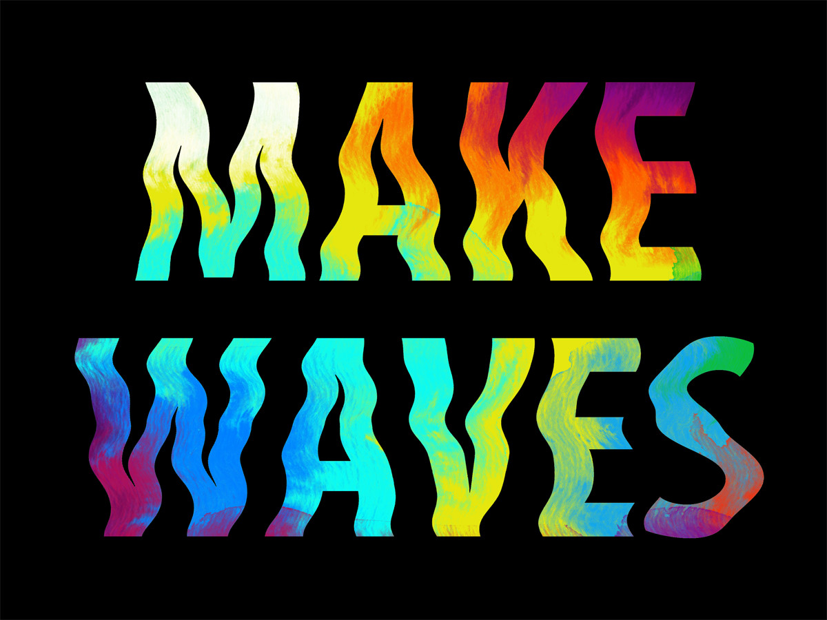
From the pages of Rin Tanaka's My Freedamn 2 book is one of my all time favorite examples of a vintage surf t-shirt graphic.

It doesn't abide by the normal rules of classic lettering or type design.  There's not much structure. But what it does have is lots of FLOW.

There's no mention of who the artist is. But since it's such a vintage design, it is certain that no computers or fancy design software were involved in it's creation.

Computers allow us to create art in perfect alignment and proportion. Let's not forget to take out the pencils, paper, x-acto knives, ink, and spray paint every once in a while to make sure that we keep the flow.

Instagram

I am posting graphic design inspiration to two Instagram accounts. 

The first is TheVecorLab's Instagram. This feed shows general Graphic Design inspiration, ideas, and tools. 

The second is a much newer Instagram account called T-Shirt Design Workshop. It focuses specifically on t-shirt design. You will see vintage tees, graphic design ideas, and printing techniques.

House Industries Lettering and Printing Workshop

I just finished up attending the House Industries Lettering & Printing Workshop in Portland. It was well worth the trek up north.

The lettering portion of the workshop was led by Ken Barber from House. Ken is a true master of his craft, and is quite good at distilling the information down into a one-day workshop.

We covered hand-lettering a roundhand script. This was not a cursive writing or calligraphy workshop where each letter is quickly drawn with a pen or brush.

Instead, Ken's technique is to show how to sketch your logotype composition with a pencil, while keeping the fundamentals of hand lettering in mind. Each person enrolled in the workshop had the project of creating their own lettering design, using just paper and pencil. Have a look at the bottom image of this post to see how mine came out.

House Lettering and Printing paper

House Lettering and Printing paper

Ken Barber in the Lettering Workshop

Ken Barber in the Lettering Workshop

House Industries posters printed by David Dodde

House Industries posters printed by David Dodde

The second day of the workshop was taught by screen printing guru, David Dodde. Like Ken, David is also a true master. He has so many great tips and techniques for screen printing on wood and paper. If you ever have the chance to participate in one of his workshops, don't hesitate to sign up.

David Dodde mixing copper dust into clear base screen printing ink

David Dodde mixing copper dust into clear base screen printing ink

T-shirt packaging printed with the split fountain screen printing technique

T-shirt packaging printed with the split fountain screen printing technique

Workshop participants were able to experiment with House's screens and print their own posters

Workshop participants were able to experiment with House's screens and print their own posters

Loot stash from the Lettering and Printing Workshop

Loot stash from the Lettering and Printing Workshop

My hand drawn sketch from Ken's lettering workshop

My hand drawn sketch from Ken's lettering workshop

Printing One Color T-Shirt Designs

I picked up this vintage Jim Morrison t-shirt (black shirt, white ink - top image) at the Rose Bowl Flea Market on Sunday.

The bottom image (white shirt, black ink) has been inverted in Photoshop, and it's a lot more obvious that it's Jim.

This is a good example of something you will encounter when printing one-color images that were originally designed to be printed with dark ink on light t-shirts. When you are printing one-color photos of faces, cars, etc onto tees sometimes you will get an "x-ray" or uplit look when you try printing that design with light ink on a dark t-shirt.

If you wanted to fix the x-ray problem, you would need to make a new color separation setup for the dark shirts in Photoshop so that the highlight areas of the design (Jim's face) are lighter than the shaded areas of the photo. Essentially, in Photoshop you could create a "baseplate" layer underneath the existing screen, and change the existing ink layer to knock out to shirt color.

But in this case, I think it makes the t-shirt look more vintage and unique.

The cracks in the plastisol ink also add another layer of charm.

By the way, if you are looking to add vintage looking t-shirt ink cracks to your designs, I have some Photoshop and Illustrator textures for t-shirt designers here called Plastisol.


T-Shirt Design Workshop 01: Foundation

The T-Shirt Design Workshop has just been posted!

If you have ever wanted to learn more about T-Shirt Design, this is a must-see workshop. It covers all the elements that go into designing a t-shirt. These are things that took me 15 years of working with surf apparel and various screen printers to learn.

Go here to find out all the details about T-Shirt Design Workshop 01: Foundation.

Make Waves [Free Download]

Today's free download is a Photoshop file that will automate the process of making waves in your photos, graphics, and typography.

Here's one example with some palm trees:

Here's another example with some type:

[watercolor effect created with AquaColour: Bleeds Photoshop Brushes]

You can download the Make Waves Photoshop effect here.

Instructions included inside the Photoshop file. Just double-click on the layer thumbnail to open the smart object. Paste in your own photo or design and save the smart object. Go back to the original file. Voila! Your design will have an instant wavy effect!

~Ray Dombroski

Halftone Spot Brushes

Today I am announcing two new items.

The first is a brand new collection of 15 halftone texture brushes for Adobe Photoshop. It's called Gritty Halftone Spot Brushes.

They fade out with no hard edges, making them perfect for adding subtle gritty texture to your type, logos, and illustrations.

Go here to see Gritty Halftone Spot Brushes.

Even better, at the bottom of this post I will tell you how you can get Gritty Halftone Spot Brushes as a Free Bonus.

The second new item that I have for you today is a bundle of some of the best textures available on TheVectorLab.

This Time Machine & Bitmap Textures Bundle includes a wide variety of 88 textures for Photoshop and Illustrator in the following styles:

    Analog Halftones (imperfect halftones from vintage magazines)
    Bad Photocopy
    Vintage Book Cover
    Fabric Textures
    Garage Textures
    Grit
    Plastisol (cracked t-shirt ink)
    Time Machine (vintage texture)

Order Time Machine & Bitmap Textures Bundle today, and get the brand new Gritty Halftone Spot Brushes for Photoshop as a Free Bonus!

Graphic Design Launch Kit

Sign up for my free email newlsetter (TheVectorLab Newsletter) below and get these Graphic Design resources!

~Ray Dombroski

A Tropical Holiday [Free Download for Photoshop]

Hola!

Last week's free download was a collection of Free Snowflake Brushes for Photoshop. These were wildly popular.

But what if your idea of "Happy Holidays" is lounging in a sunny tropical place, far away from the cold and snow? Well, I've got you covered!

Today's free download is a Palm Tree graphic with texture generated using the Bad Photocopy Texture Template.

Plus there are 5 new Bad Photocopy Textured Snowflakes (much higher resolution than last week's snowflakes). These are in Photoshop PSD and Photoshop Brush format. You even get the image below in a layered PSD file just in case you want to use the type, stripes, or other elements in your own designs!

Go here to download the free Palm Tree and the New Snowflakes!

~Ray Dombroski

Did I mention:

Textured Snowflake Photoshop Brushes

Hello!

Do you need to make designs for this holiday season? How about greeting cards or invitations to holiday parties?

Today's free download may just help you in your process. It's a collection of 24 textured snowflake brushes for Photoshop!

(By the way, the texture for these brushes was generated using the Bad Photocopy Texture Template. If you haven't seen how this template works, be sure to check out the link at the bottom of this email.)

But first, go here to download the brushes:

After you download the snowflakes, have a closeup look at the brushes and also the layered PSD file. This will give you a good idea of the authentic textures you can get with the Bad Photocopy Texture Template!

This template is extremely useful (and fast!) for making vintage textures for all kinds of designs.

If you didn't see this week's new video showing how the template works (and how you can use it to make great colored and layered vintage designs), follow this link. (Look for the blue video)

A Secret Graphic Design Technique from the Archives

There's a graphic designer's old, secret method to transform mundane designs into high quality vintage-style art.

This technique can completely transform the look of your graphics. Especially if you are combining non-cohesive elements like clean vector art, along with a pixelated low resolution photo, some badly live-traced vector art, and a scribbled hand-drawing.

Like oil and water, these kinds of art usually don't mix well together.

The way to solve this problem was knowing how to apply the right kind of texture.

The secret to adding this kind of texture was to wait for the office photocopier to get out of alignment. Next, you would make a copy... of a copy... of a copy... until just the right amount of texture was achieved!

The problem is, today's modern copiers are just too reliable. This makes it very unlikely that designers can utilize this method to meet project deadlines.

But now, there is a solution. You can now get these Bad Photocopy effects easier than ever! You can even use this method with colored and layered designs!

This is the #1 texture method I use in my own designs for real clients and professional work. 

Have a look at the before & after image of this t-shirt design:

Here's a video showing exactly how to apply this method with color and layers.

Go here to get Bad Photocopy Texture Template now.

Aloha,

Ray Dombroski

A couple more things:

  • Did you notice that Bad Photocopy Texture Template also includes a free download of Bad Photocopy Recycle Bin? (50 textures - $34 value!)
  • An even better deal than mentioned above is the Bad Photocopy Master Collection. It includes ALL of the Bad Photocopy collections. Purchase now and save more than 50 percent!

Set up a T-Shirt Spec Sheet

When you send out your t-shirt art to a screen printer, you will need to include the full size art (all color versions) and a spec sheet. The Spec Sheet, also known as a CAD, Matrix, or Make Sheet shows the printer the placement of the art on the shirt. It specifies:

  • Ink color combinations for each colorway. Your ink colors need to be in the same order in the spec sheet. Normally, t-shirt ink colors are specified using the Pantone Solid Coated Guide.
  • T-shirt fabric colors to use for this design. Make sure to match up your t-shirt color to the corresponding ink color combination.
  • Print techniques & embellishments: “Soft Hand”, no underbase, high density ink, glitter ink, reverse print, etc.
  • Proper neck labels, hang-tags, packaging, hang tags, etc. to use with this tee.
  • Name, Style Number, Season, and any other info that you may need to reference the design.